This phase followed the earlier Planet Lodges rebrand. The identity existed, but execution across touchpoints was uneven. Guest-facing materials and in-house documents carried mixed layouts, dated presentation, and inconsistent use of the brand. The work focused on making the rebrand visible in real operational and guest-facing materials.
Scope: hospitality collateral; brand rollout; photography direction; signage direction; template standards.
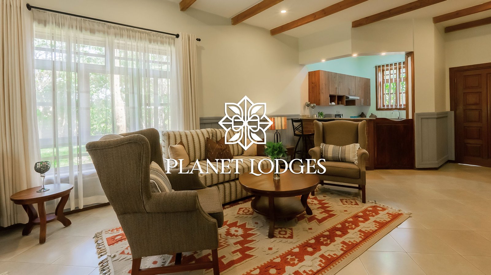
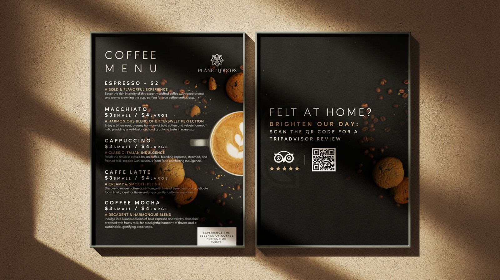
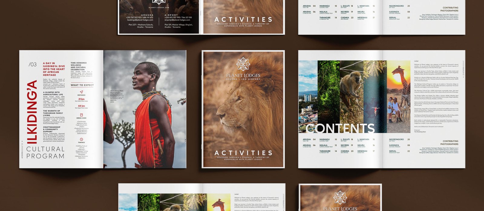
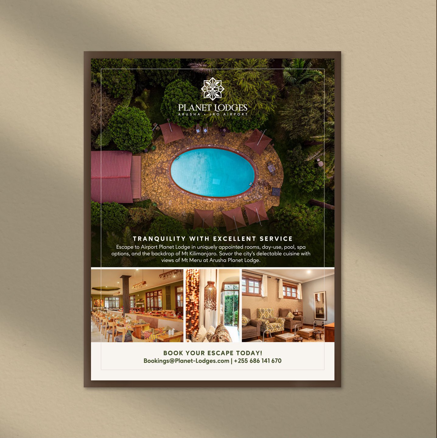
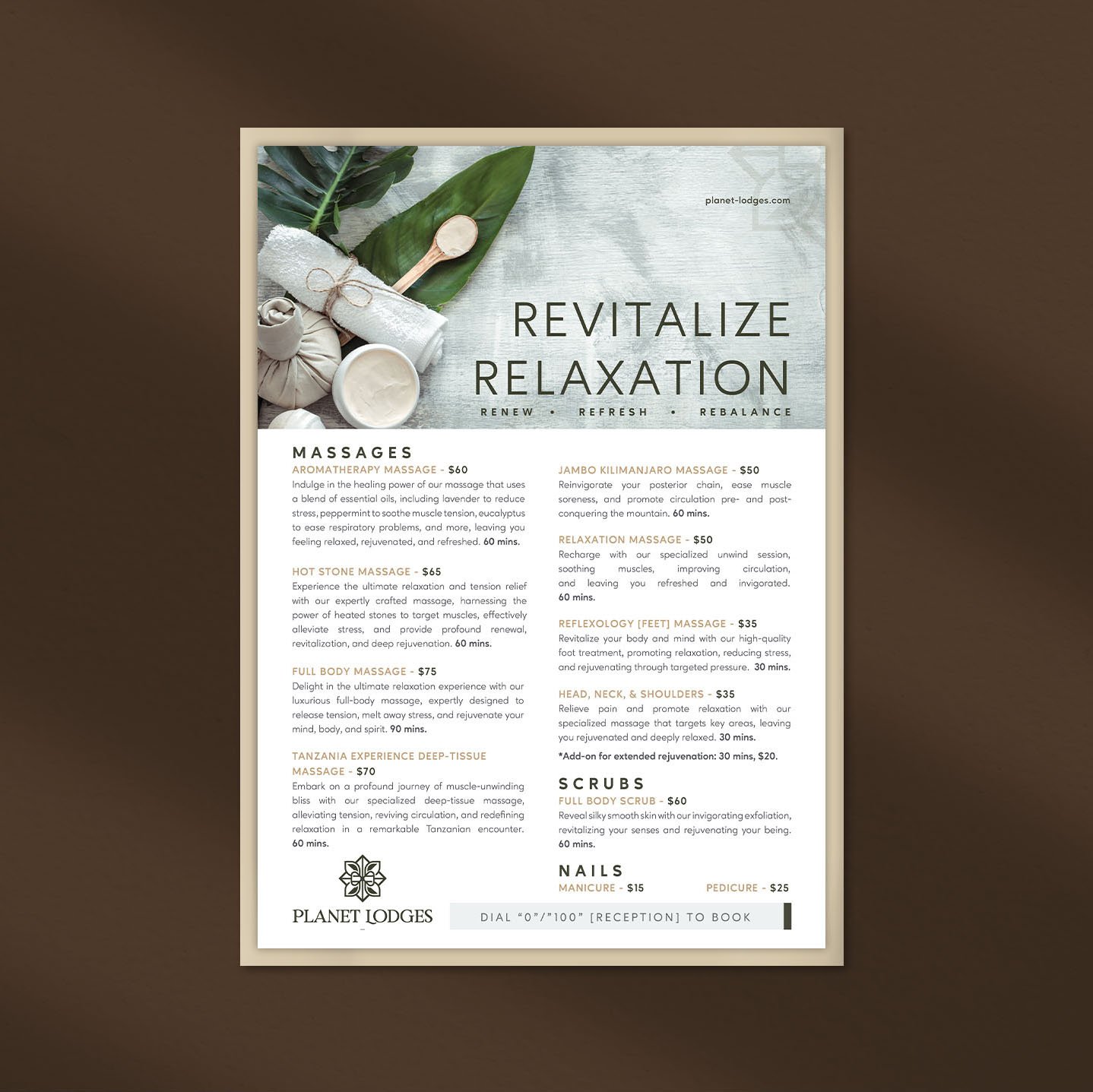
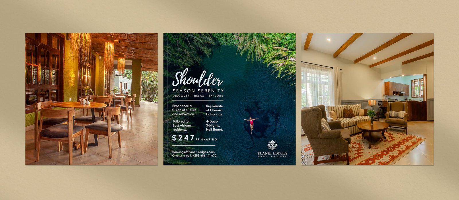
Guest-facing collateral rebuilt to reflect the rebrand in real guest moments. Clear hierarchy, refined layout, and consistent brand cues across menus, experiences, and print placements.
Visuals: Coffee menu; Activities booklet; A4 advertisement; Spa menu.
We had just renovated our properties and needed to market them properly. They came up with a clear theme that tied it all together and actually drove bookings. For the first time, we have a standard guest experience across all our lodges.
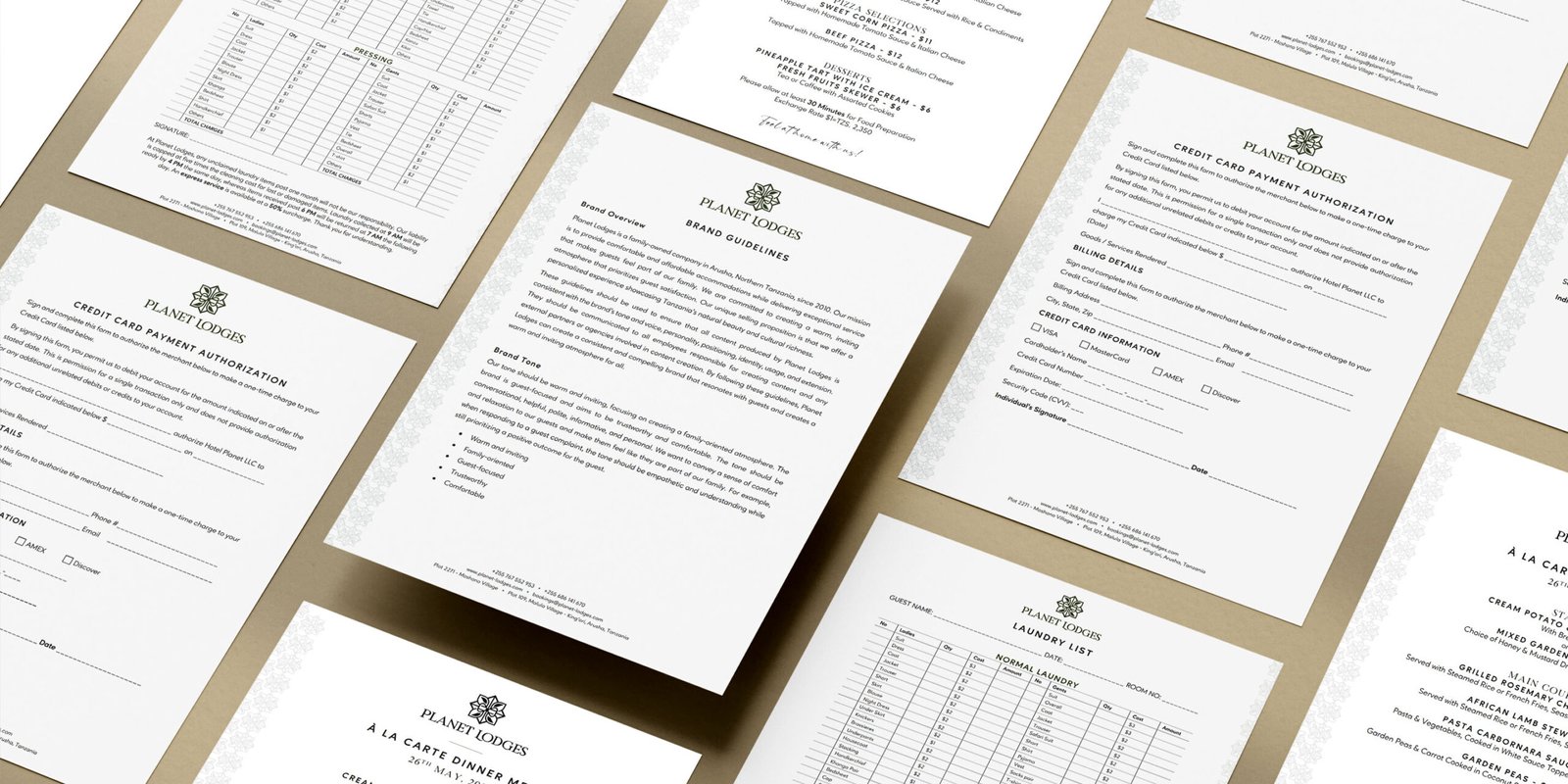
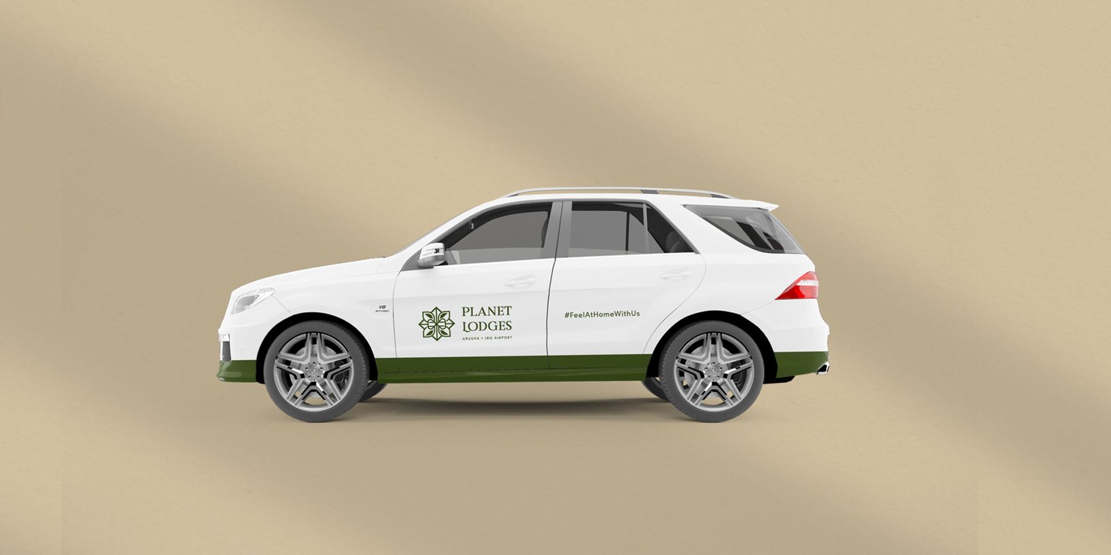
Operational documents standardised so the brand reads consistently behind the scenes, not only at the front desk. Vehicle branding extended the same standard into physical touchpoints beyond the property.
Visuals: Internal documents set; Car branding.
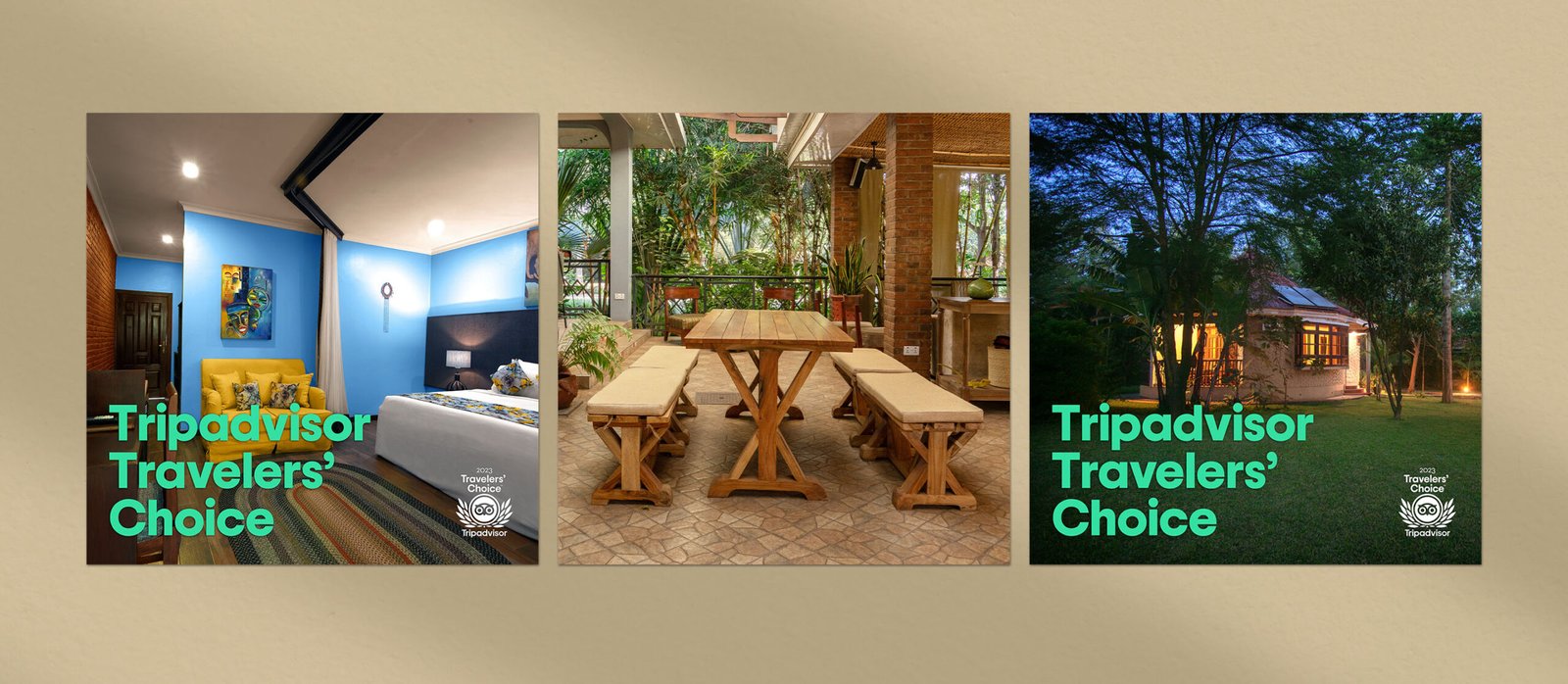
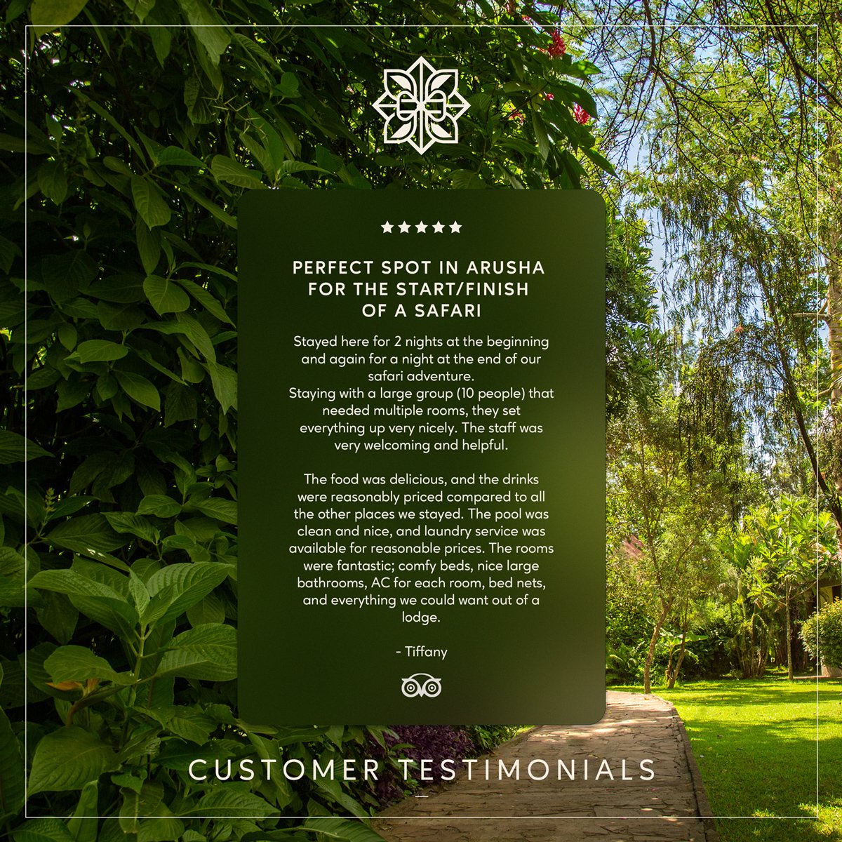
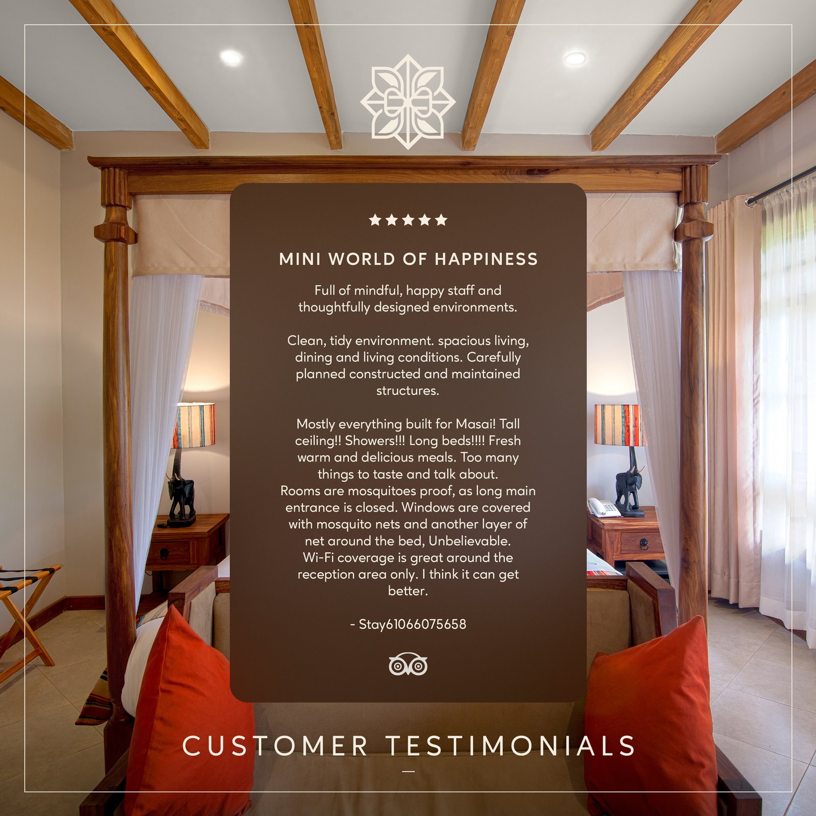
Brand presentation carried into social and credibility assets, using the renovation story and guest proof in a single visual language. Awards and reviews were treated as part of the brand system, not add-ons.
Visuals: Renovation social content; TripAdvisor award graphics; Guest reviews in the new brand style.
Email me if your lodge or hotel brand needs stronger rollout across real touchpoints: strategy@theascend.net.