A luxury hospitality identity created from scratch, with a clear visual system and organised assets designed for consistent use.
Context
ADINA Lodges launched as a new luxury lodges brand, with the intention to feel premium and established from the first release, not “new” or experimental. In high-end hospitality, first impressions are decisive, so the identity had to signal quality in the same way the guest experience would. It also needed to stay consistent as new lodges, new photography, and more marketing materials are added over time.
The work covered creative project management and creative direction from the start, shaping a complete brand identity rather than a single logo. The name’s biblical meaning, delicate, refined, and gentle, set the tone, then the system was built for real use across brand touchpoints: logo variations, defined typography, a luxury colour palette, and clear brand guidelines supported by practical applications.
— Creating a premium brand position without existing assets or reference standards — Designing a logo system that stays recognisable across print, digital, and merchandise — Selecting typography and colour that feel luxury-led, but remain practical for everyday use — Providing a clear visual guide so implementation stays consistent across teams — Delivering files in a structure that prevents confusion and protects approved versions
Approach
— Defined the brand persona and narrative, anchored in refinement and modern luxury cues — Designed a logo suite with primary brandmark and supporting icon use for flexible application — Set the typography system for consistent hierarchy and layout decisions — Built a colour palette with clear codes for reliable reproduction across media — Produced a mood board that showed the visual language in context, including applications and image tone — Organised delivery into clear folders, separating logo variations and source files, fonts, and mood board resources
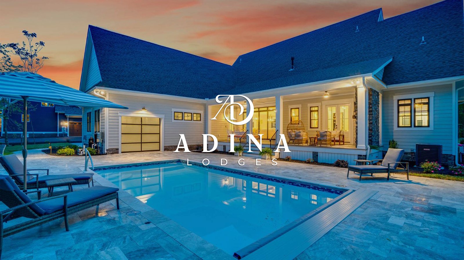
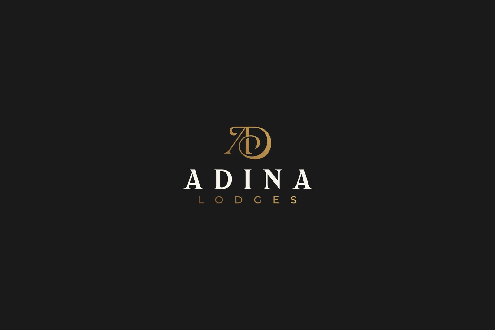
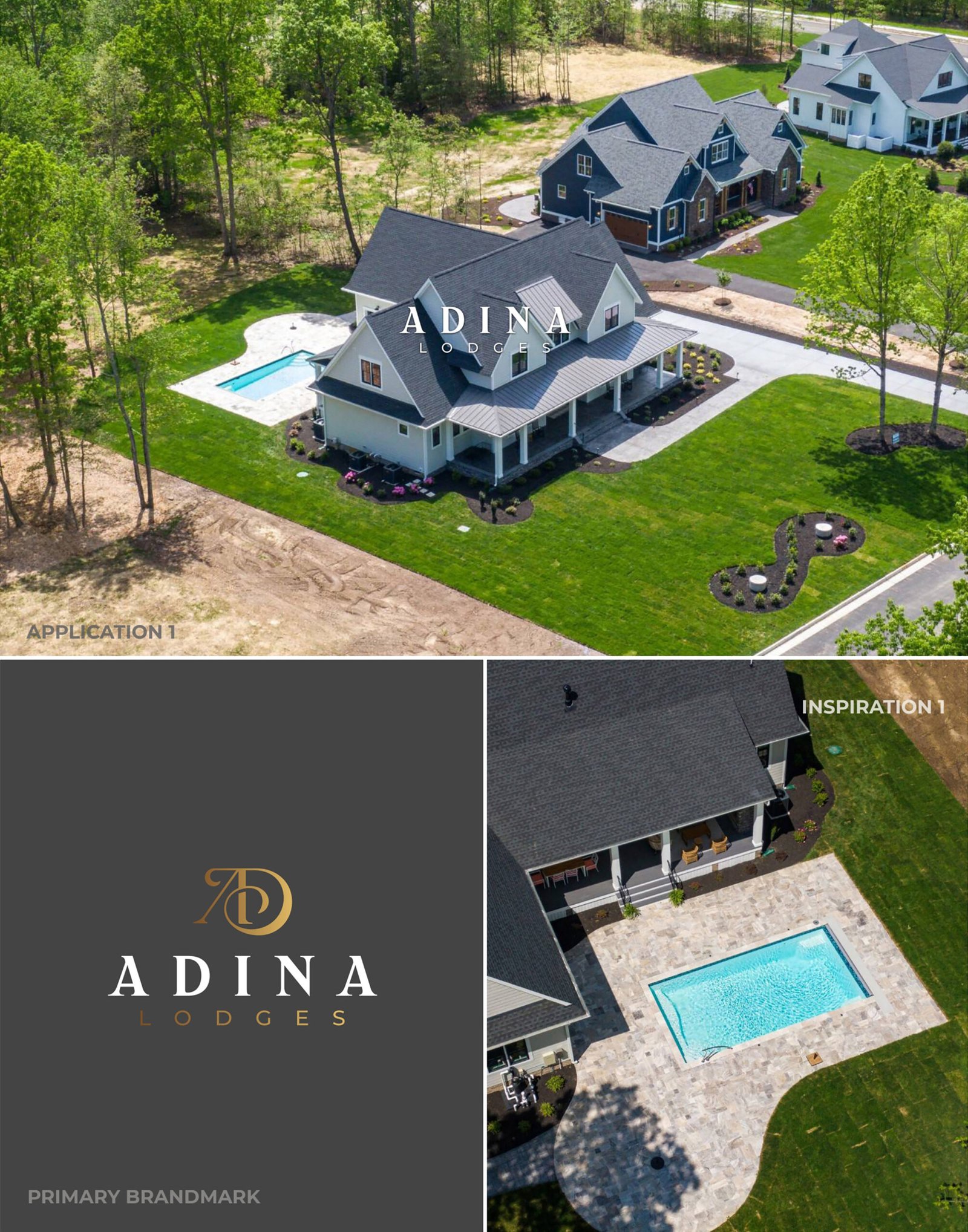
Visuals I
Real-world brand presence, showing the logo holding its character against premium hospitality imagery and dark backgrounds without losing legibility. Visuals: Application 1 aerial placement; primary logo on dark background; inspiration reference image
The brand finally looks the way we always wanted it to feel. When the files were handed over, everything was organized and ready to go. Our staff didn't have to guess how to use any of it.
Partners
ADINA Lodges
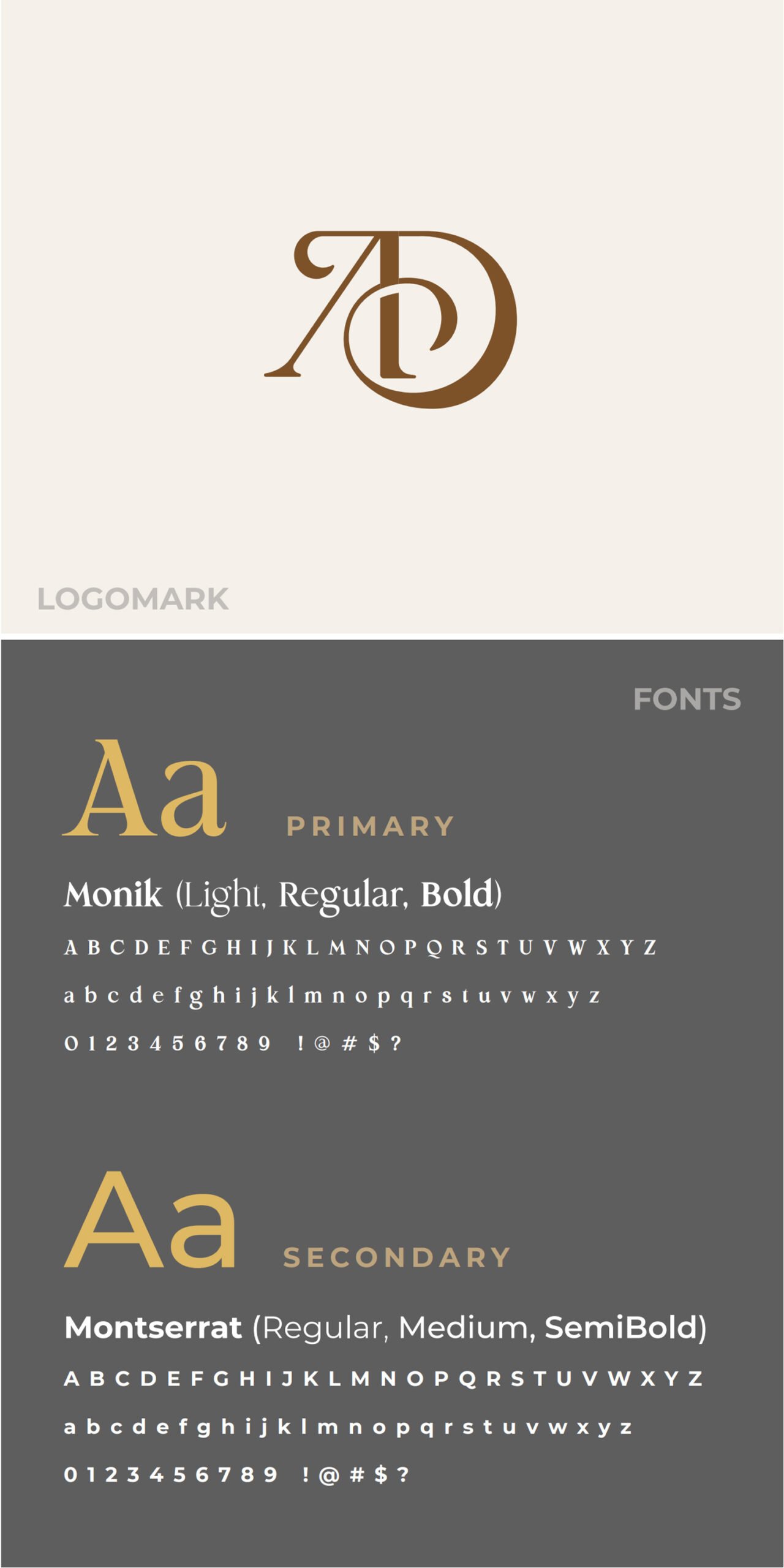
Visuals II
Core identity standards, showing the primary mark and the typography choices that control hierarchy and keep layouts consistent across materials. Visuals: Logomark; typography system Monik (Light; Regular; Bold); typography system Montserrat (Regular; Medium; SemiBold)
Visuals III
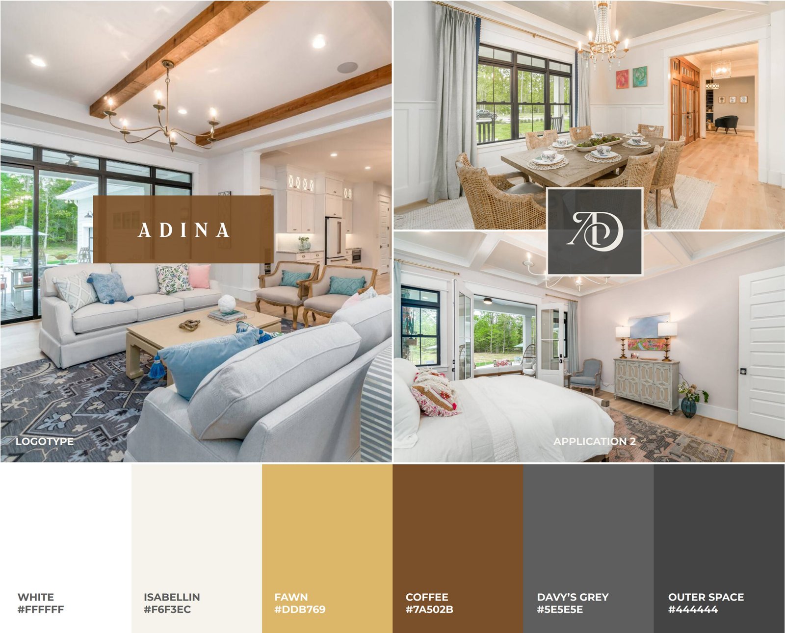
Roll-out readiness, showing consistent application in interiors alongside a defined luxury colour palette for repeatable use across print and digital. Visuals: Application 2 interior placements; colour palette with codes
Outcome
— A complete brand identity system created from inception, designed for luxury hospitality expectations — A flexible logo suite suitable for print, digital, and merchandise use — Typography standards defined for consistent hierarchy and brand tone — A documented colour palette for controlled, repeatable application — A mood board that makes the intended look and feel easy to apply across touchpoints — Organised asset delivery supporting straightforward handover and consistent use
Cookie Consent
We use cookies to improve your experience on our site. By using our site, you consent to cookies.
Cookie Preferences
Manage your cookie preferences below:
Essential cookies enable basic functions and are necessary for the proper function of the website.
Name
Description
Duration
Cookie Preferences
This cookie is used to store the user's cookie consent preferences.