BSZ rebrand built to last

Client
British School of Zanzibar
Design
Yöy Agency, USA
Expertise
Project Oversight
Year
2019
End-to-end rebrand direction, turning a dated school badge into a clear identity with a refreshed slogan and standards the team could apply consistently.

Context

The British School of Zanzibar, a leading international nursery and primary institution, is located in the historical and cultural hub of Zanzibar. Operating as a multicultural gateway, the school delivers a dual curriculum integrating the rigorous standards of the British National Curriculum with the cultural depth of the Tanzanian education system.


By 2019, the visual identity had become a strategic constraint, as the existing mark was visually juvenile and out of alignment with the school’s academic ambition and international reputation. Senior direction was used to align the Board of Directors on a new institutional vision and manage the delivery of a mark that maintains integrity across every school touchpoint. The result was a professional identity that accurately reflects the school’s academic ambition and standing.

Scope: Creative Briefing & Intent; Agency & Vendor Coordination; Sign-off & Feedback Control; Stakeholder Reporting.

Challenge

— Replacing a legacy symbol without eroding trust within the local community.

— Aligning a Board of Directors on a refreshed strategic slogan.

— Translating director-level intent into a clinical brief for an external studio.

— Preventing the brand degradation that typically occurs in day-to-day school operations.

— Ensuring the final assets were simple enough for non-creative staff to use correctly.

Approach

— Initiated the case for change, secured leadership buy-in, and established the quality standards for the new identity.

— Researched and vetted multiple studios, then selected an external partner equipped to handle the school’s cultural context and expectations.

— Facilitated a structured session with the Directors to define positioning, strengths, gaps, and future growth plans.

— Authored the creative direction inputs: reference brands, typography preferences, and the visual simplicity required for long-term durability.

— Managed budget alignment and contracting, then led the review process from early concepts through to final refinement.

— Acted as the single point of contact for feedback, distilling mixed opinions into one clear direction to prevent project drift.

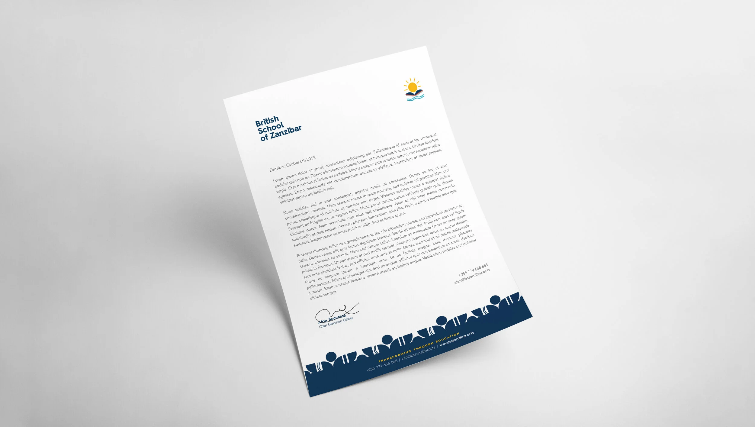
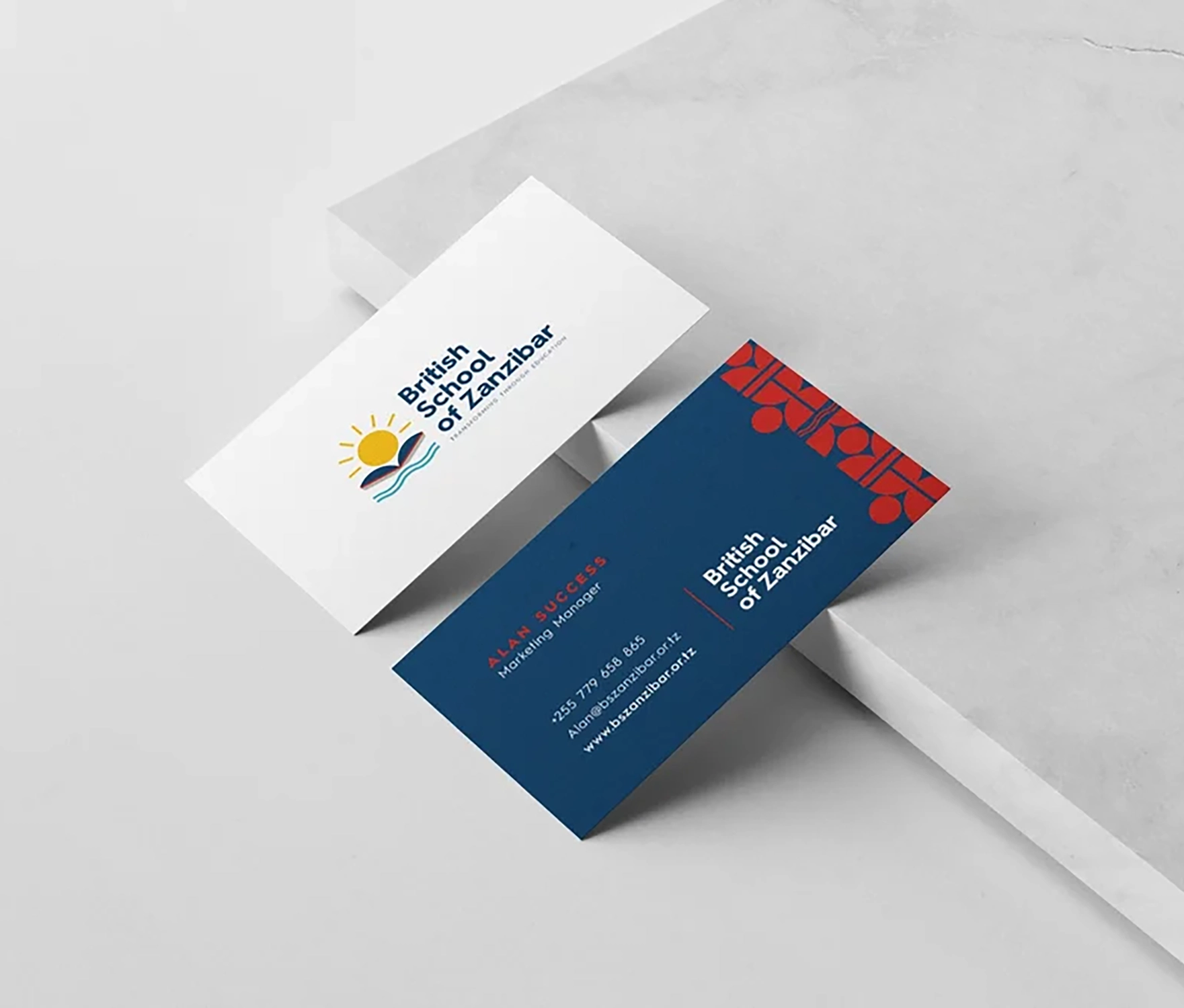
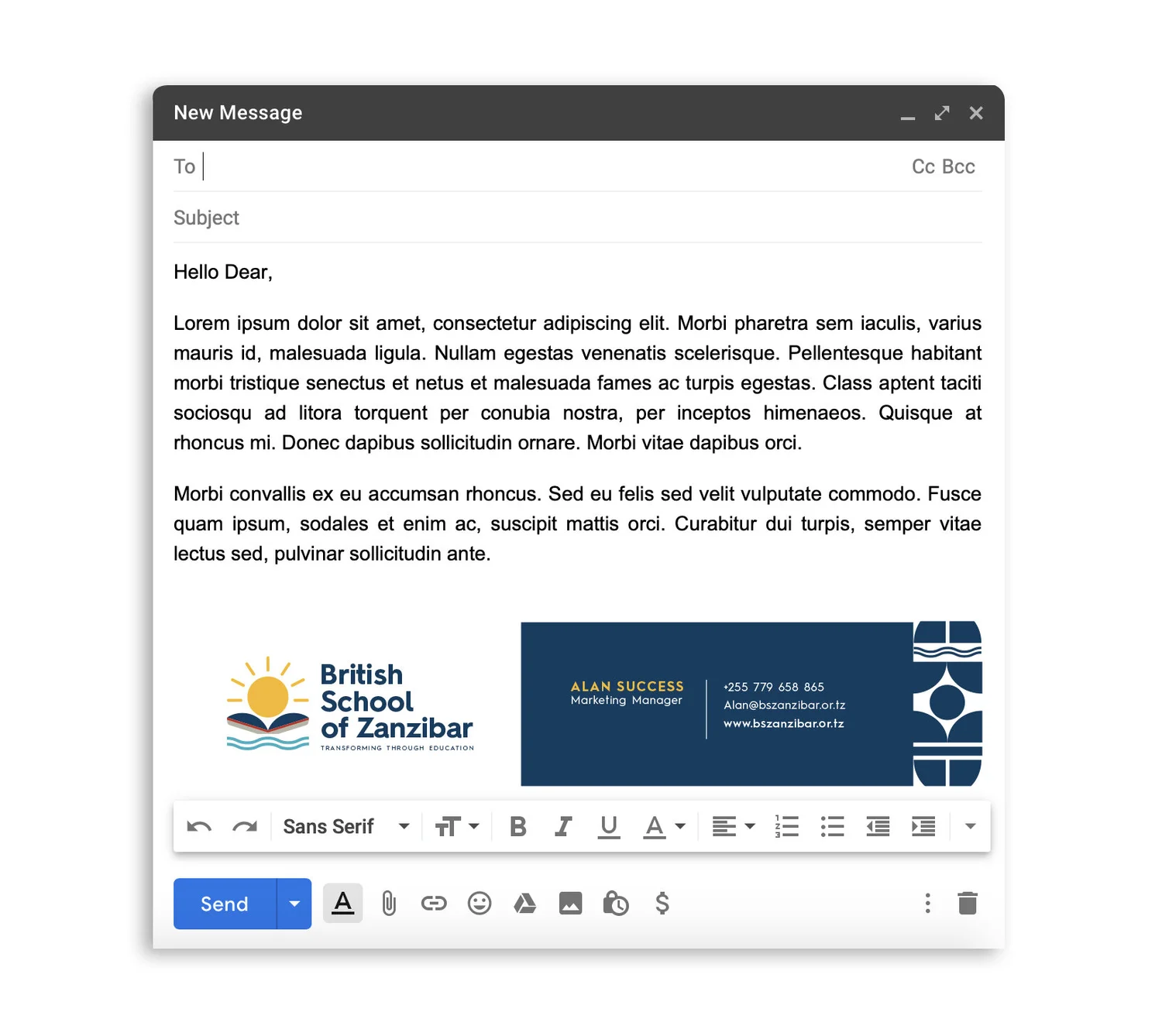
— Oversaw the delivery of templates and assets, ensuring a consistent rollout across communications and school materials.

Visuals I

Identity change in full, from legacy to new mark, with the meaning built into the logo so decisions remain easy to defend and repeat.

Visuals: Previous logo (smiling sun badge). New primary logo. Slogan and Values alignment. Symbol meaning breakdown (Sun, Book, Waves, Child).

Before
After

The brand finally matches the school we have become. What helped most was having someone guide us through each stage so our decisions made sense. The final files are incredibly practical for our team to use every day.

Director
British School of Zanzibar

Visuals I​I

Brand foundation, establishing the technical standards required to protect the visual integrity of the school’s new identity.

Visuals: The selected colour palette and typography standards for the new identity.

Visuals I​II

System application, demonstrating the transition from strategic standards to practical, day-to-day institutional assets.

Visuals: Letterhead, business cards, and email signature showing the system in use.

Outcome

— A new logo system with built-in meaning, combining recognisable elements (sun, book, waves, child) into a mark that can be explained and defended
— Slogan updated and applied: Transforming Through Education
— Brand guide delivered to protect consistency and reduce subjective interpretation over time
— Core templates delivered for immediate use: letterhead; business cards; email signature
— A coherent foundation for updating wider materials, including website, social media, and signage