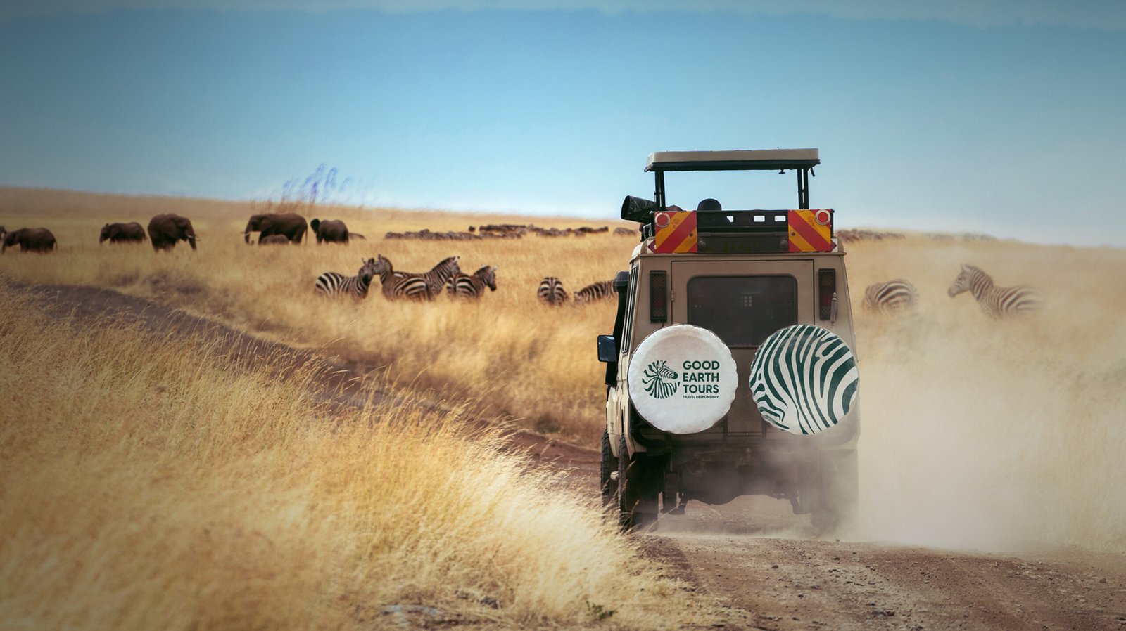
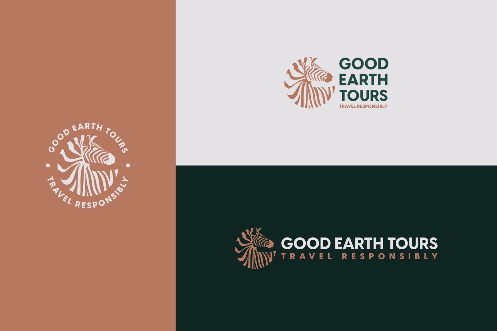
The rebrand has completely changed how we present our tailor-made safaris. We finally have a visual identity that matches the experience we provide on the ground. It has given our international agents much more confidence in selling our packages.
Co-founder
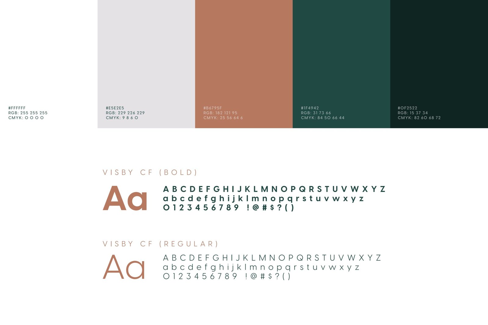
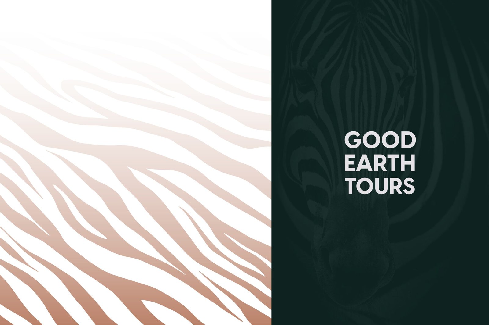
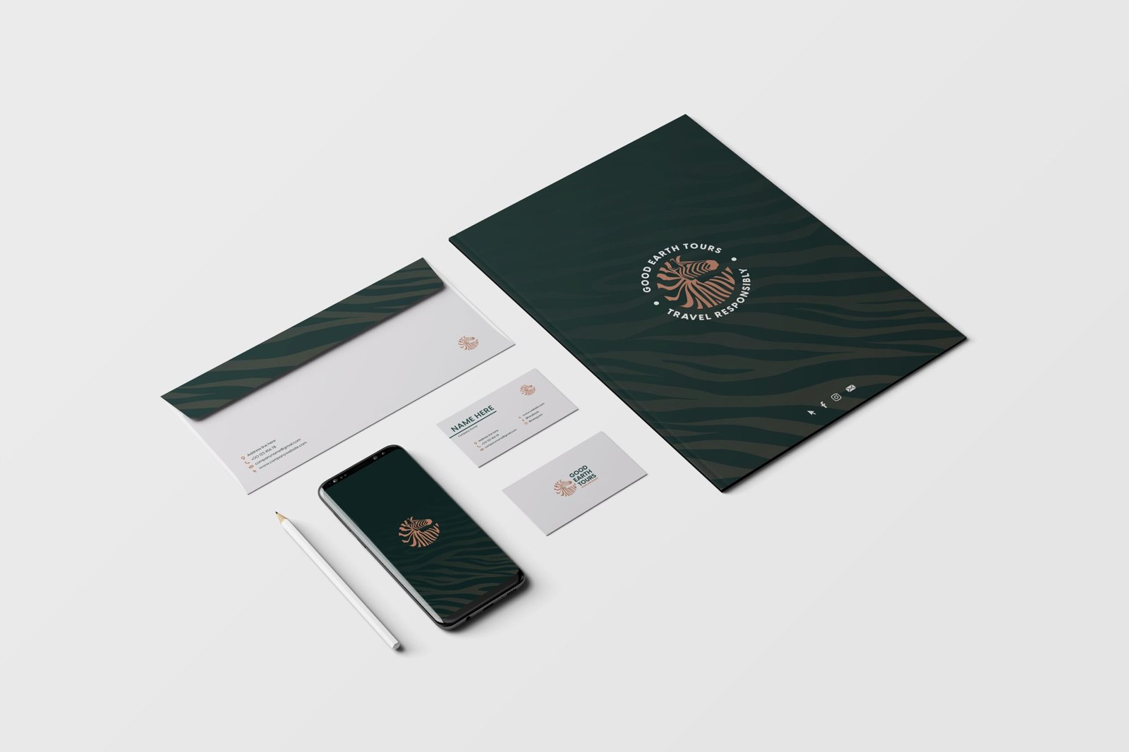
Good Earth Tours