A founder-aligned identity reintroduction, governed end to end and delivered as a complete, usable brand system.
Context
Planet Lodges was entering a new phase that required a clearer, more refined identity to match the guest experience: genuine Tanzanian hospitality delivered with care and calm sophistication. The previous mark functioned as a basic monogram, with limited meaning beyond initials and little ability to express sustainability or long-term intent. The reintroduction anchored direction in the founders’ original reference point: Sage, chosen to symbolise harmony with nature, balance, and renewal, then translated into an owned emblem and a system designed for consistent use.
— Move from a generic, initial-led mark to an owned symbol with clear sustainability meaning — Set a premium, quiet tone that feels timeless and natural, without losing warmth — Maintain founder alignment through controlled reviews, clear options, and clean sign-off stages — Deliver a system that external teams can apply without interpretation drift
Approach
— Planned the project structure and approval stages before design execution began — Sourced and assessed external designers, shortlisted three, then appointed the best fit for capability and founder working style — Authored the creative brief, including success criteria, non-negotiables, and inspiration boundaries — Supplied curated references to anchor the direction in Sage-led nature symbolism and refined hospitality cues — Managed the founder-to-designer loop, translating feedback into clear, actionable direction and preventing visual drift — Guided option reviews towards the most durable identity route, suitable for long-term use and future investment — Oversaw full system delivery: logo suite, palette, typography hierarchy, patterns, brand board, and organised handover folders
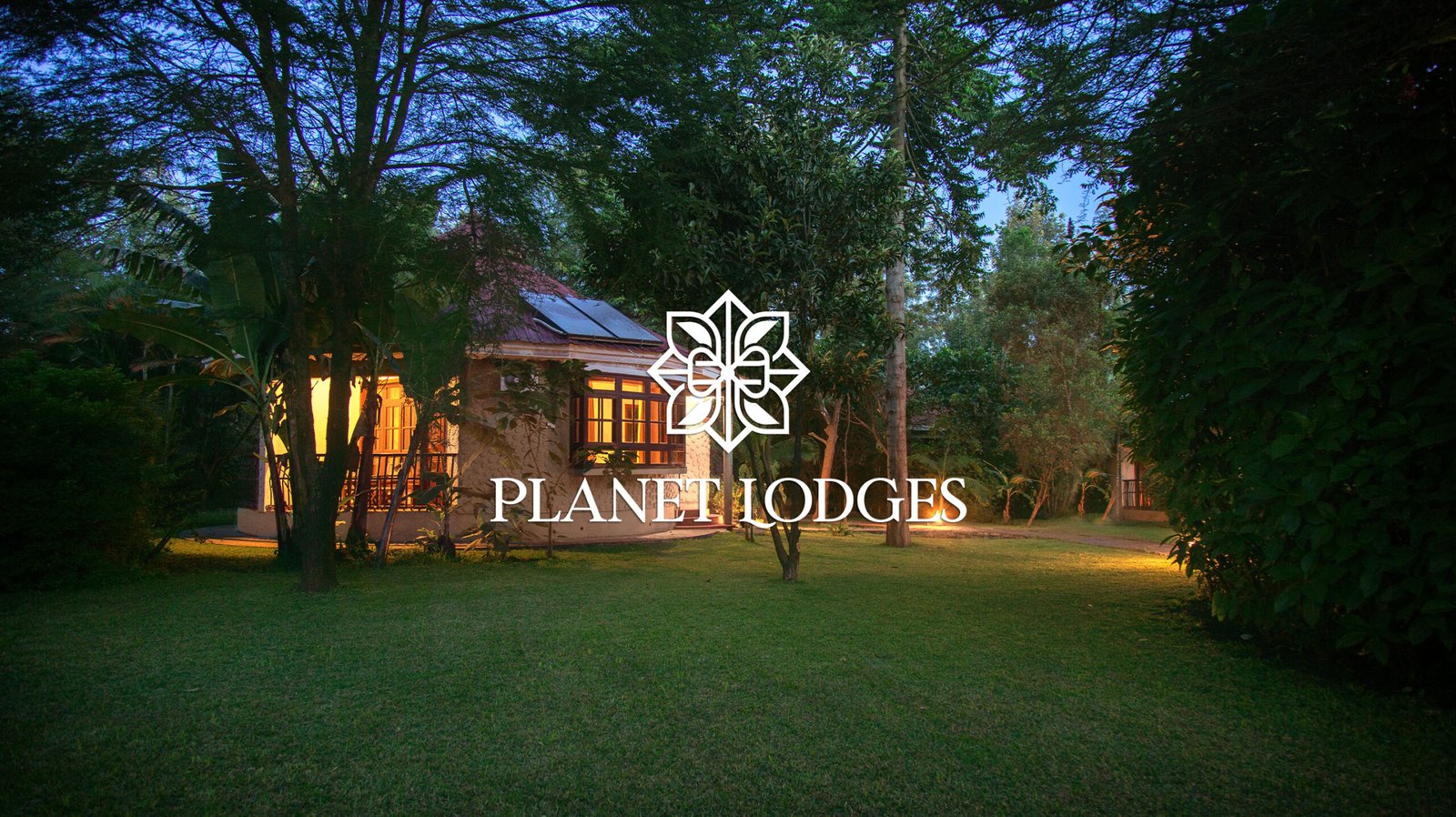
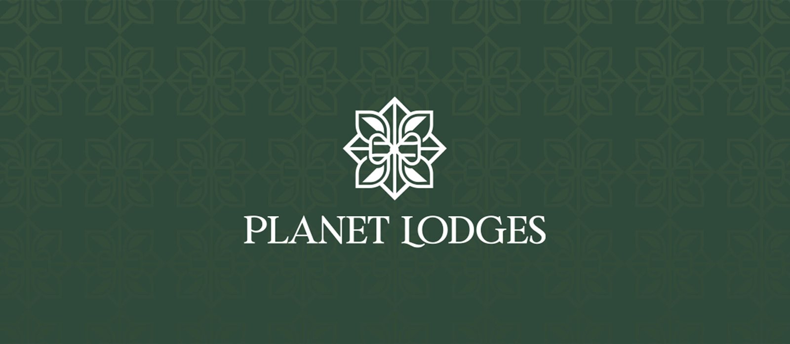
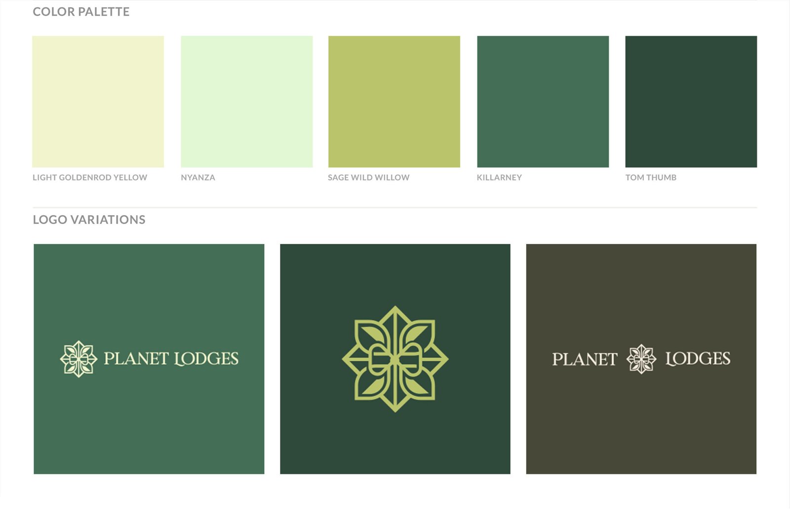
Visuals I
Identity clarity and symbol ownership, showing the move from initials to a sustainability-led emblem designed for continuity. Visuals: Old logo vs new logo comparison; primary logo presentation; logo variations (emblem left; emblem only; centred); colour palette part 1 (primary)
Before
After
The rebrand was handled perfectly. The quality is exactly what you would want, and I would recommend this approach to anyone without a second thought.
Director
Planet Lodges
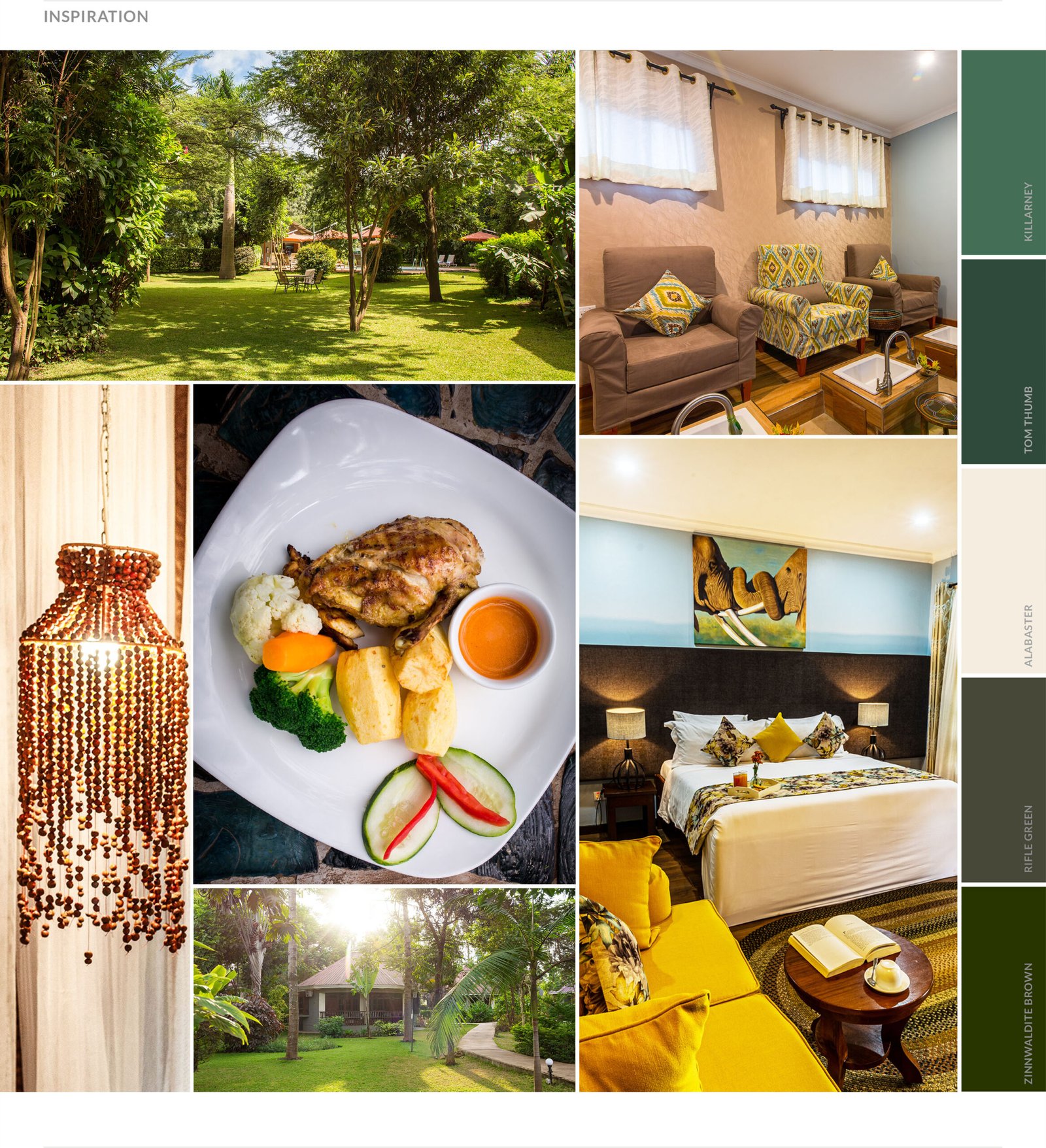
Visuals II
Inspiration and imagery direction, defining what the brand references and how future photography should appear. Visuals: Inspiration and imagery references; imagery direction for future use; colour palette part 2
Visuals III
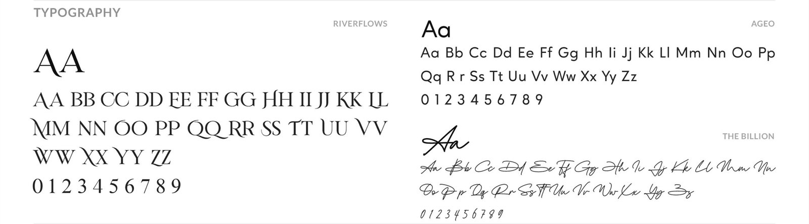
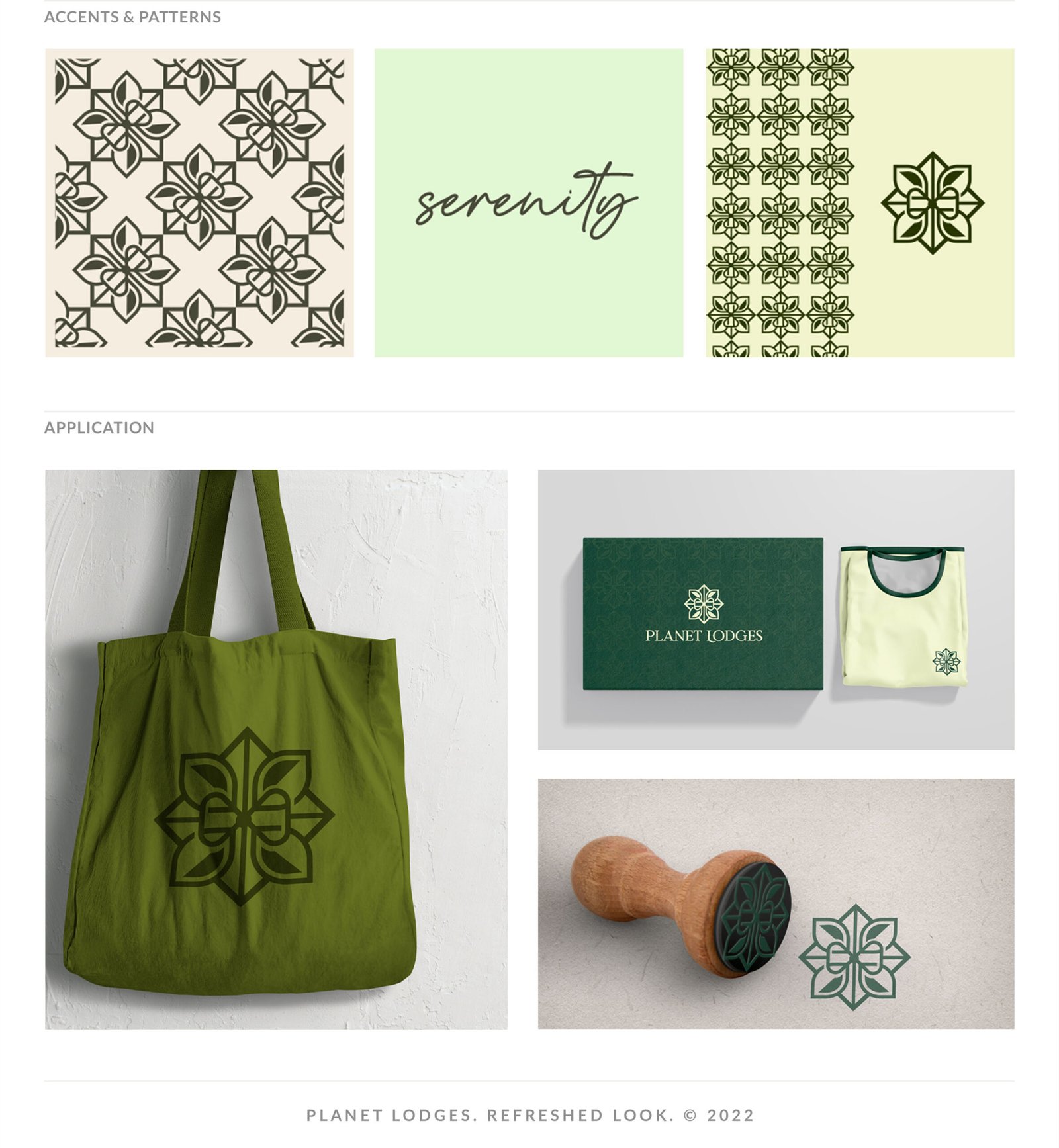
System discipline through typography and pattern work, extending recognition beyond the mark into repeatable brand texture. Visuals: Typography system (Ageo; Riverflows; The Billion); brand patterns; pattern application; and digital signature
Outcome
— Delivered a complete, organised identity kit across five folders: Logo; Official Fonts; Brand Board; Colour Palette; Brand Patterns — Produced a full logo system: Primary; Secondary; Centred; Logomarks/Icons — Established the approved typography set: Ageo (primary); Riverflows and The Billion (secondary) — Introduced two patterns to extend recognition and add depth across digital and print use — Supported a higher internal benchmark for brand investment, contributing to later renovations and a refreshed website direction
Cookie Consent
We use cookies to improve your experience on our site. By using our site, you consent to cookies.
Cookie Preferences
Manage your cookie preferences below:
Essential cookies enable basic functions and are necessary for the proper function of the website.
Name
Description
Duration
Cookie Preferences
This cookie is used to store the user's cookie consent preferences.