Planet Lodges rebrand rollout and brand standards
Planet Lodges
External
Rebrand Direction, Brand Standards
2022
Context
Planet Lodges was entering a new phase that required a clearer, more refined identity to match the guest experience: genuine Tanzanian hospitality delivered with care and calm sophistication. The previous mark functioned, but it did not give the brand enough distinction or system value for future use.
Scope: rebrand direction; designer sourcing; creative briefing; founder review control; brand standards handover.
Challenge
- Move from a generic initial-led mark to an owned symbol with clearer sustainability meaning.
- Set a quiet premium tone that felt timeless and natural without losing warmth.
- Maintain founder alignment through controlled review rounds.
- Deliver brand files in a way future marketing and operations teams could use correctly.
Approach
- Planned the project structure and approval stages before design execution began.
- Sourced and assessed external designers, shortlisted three, then appointed the best fit for the work and founder style.
- Authored the direction brief, covering brand meaning, tone, references, visual expectations, and practical usage needs.
- Controlled review feedback so decisions moved towards standards, not personal preference.
Visuals I
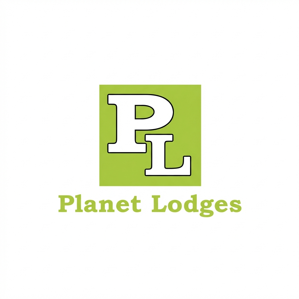
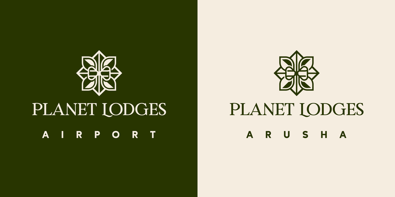
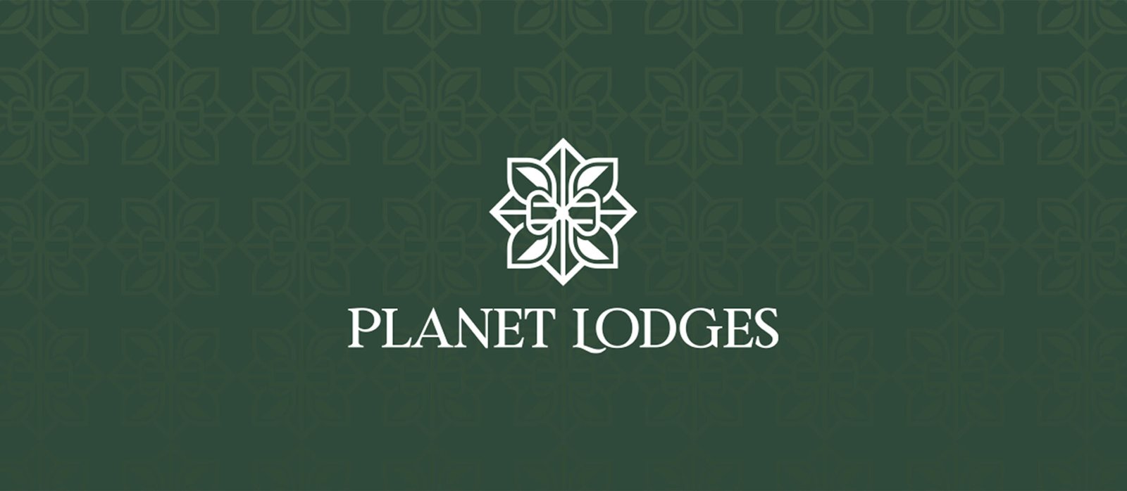
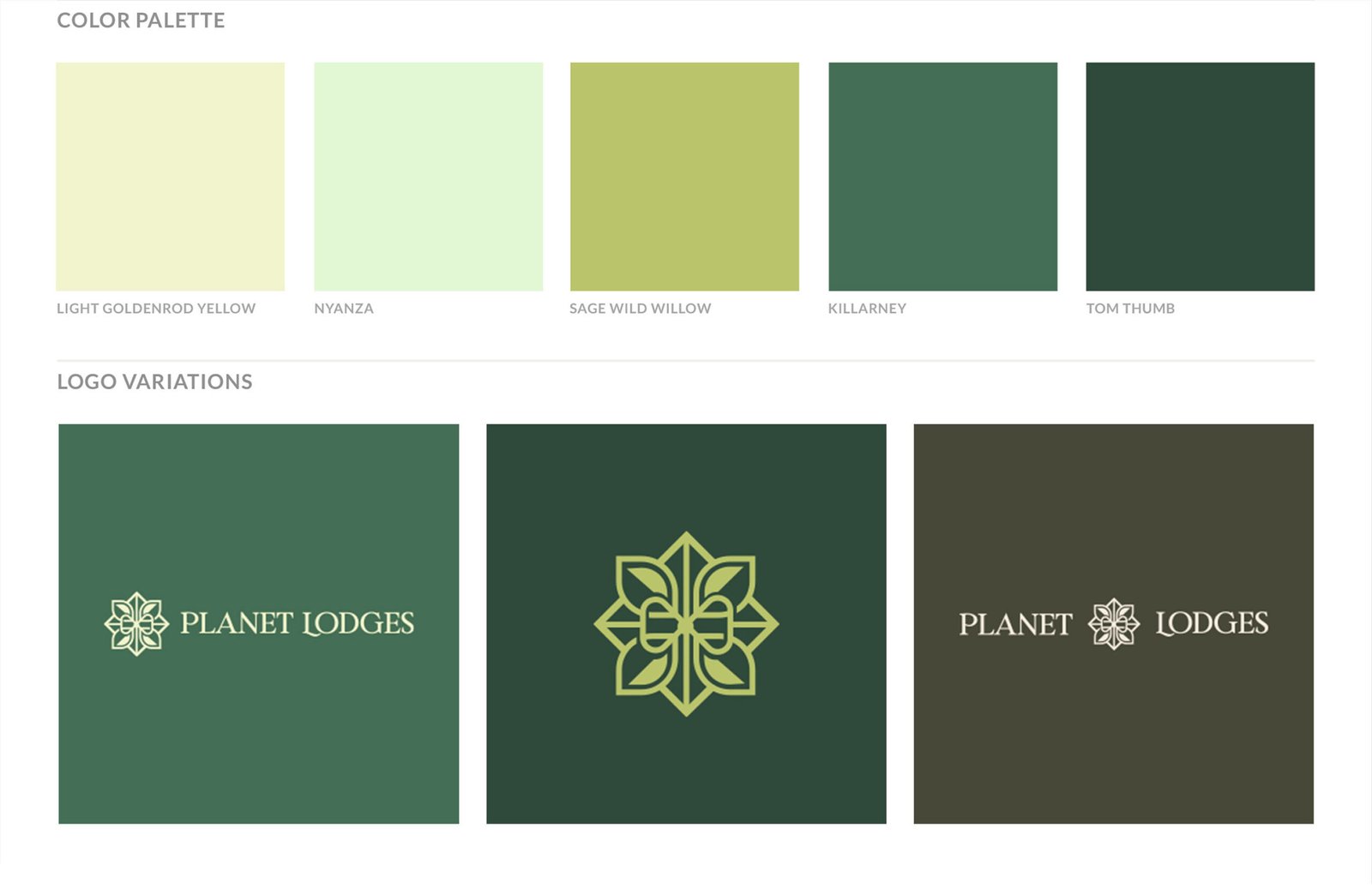
Identity clarity and symbol ownership, showing the move from initials to a sustainability-led emblem designed for continuity.
Visuals: Old logo vs new logo comparison; primary logo presentation; logo variations (emblem left; emblem only; centred); colour palette part 1 (primary)
Visuals II
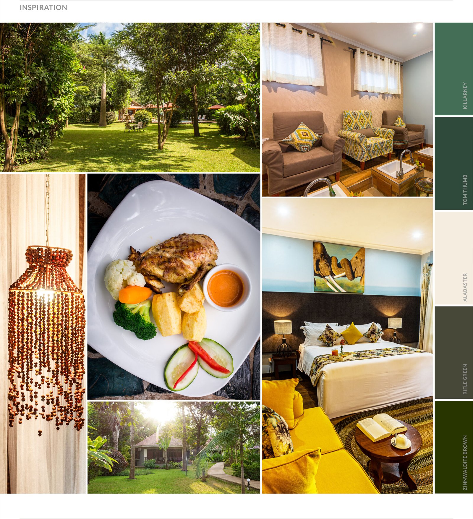
Inspiration and imagery direction, defining what the brand references and how future photography should appear.
Visuals: Inspiration and imagery references; imagery direction for future use; colour palette part 2
Visuals III
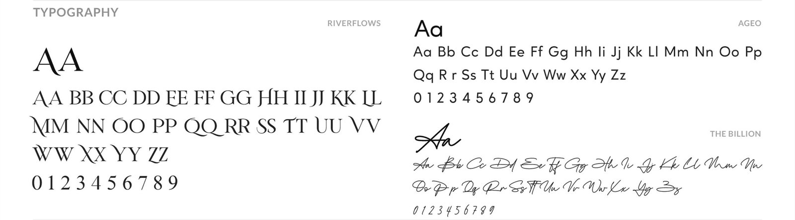
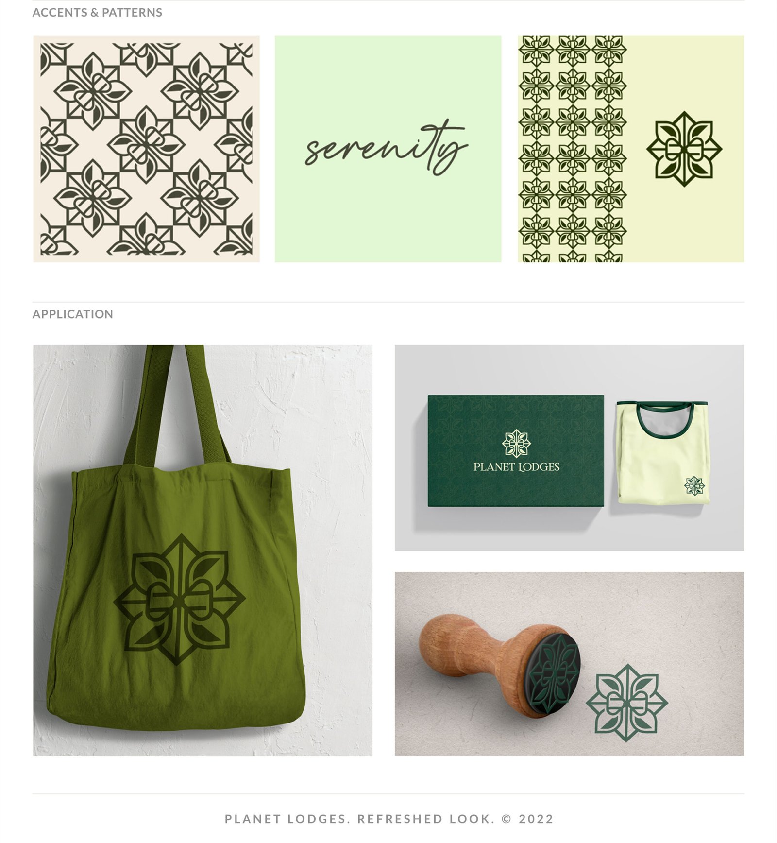
System discipline through typography and pattern work, extending recognition beyond the mark into repeatable brand texture.
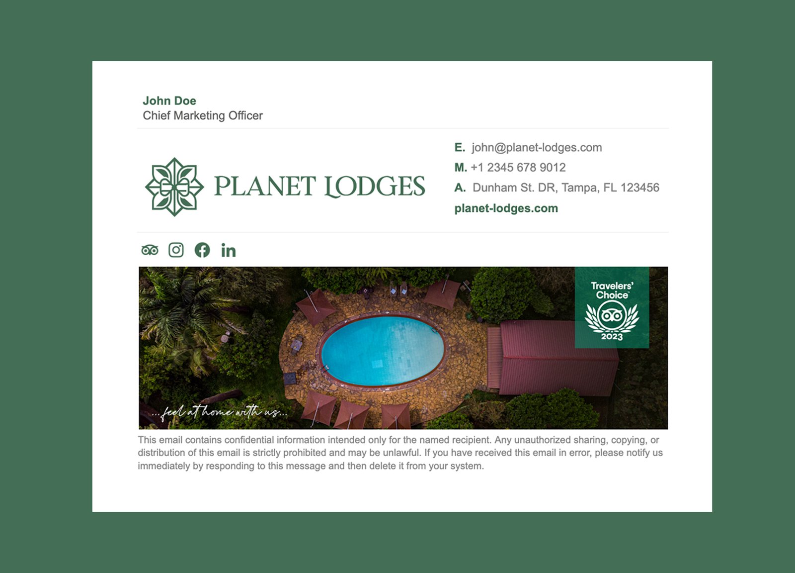
Visuals: Typography system (Ageo; Riverflows; The Billion); brand patterns; pattern application; and digital signature
Outcome
- Complete identity kit delivered across logo files, official fonts, brand board, colour palette, and brand patterns.
- Full logo system produced for primary, secondary, centred, and icon use.
- Typography, colour, and pattern standards gave the brand clearer future-use rules.
- Founder feedback was organised into a practical approval path and final handover.
Email me if your rebrand needs senior direction before a designer starts: st******@*******nd.net.