Good Earth Tours rebrand rollout
Good Earth Tours
External
Rebrand Direction, Brand Standards
2021
Context
Good Earth Tours positions itself as an ethically responsible safari operator in East Africa, built around a Travel Responsibly promise and the values Community, Discovery, Adventure, and Passion. The existing identity needed stronger consistency and a clearer visual standard for future marketing use.
Scope: rebrand direction; designer briefing; stakeholder review; brand standards; practical handover.
Challenge
- Modernise a legacy logo without losing recognisability.
- Keep decisions clear across stakeholders and an external designer.
- Build an identity system that works in real use, not only in mockups.
- Give the team standards they could apply after handover.
Approach
- Defined the rebrand goal, success criteria, and approval path before design work began.
- Commissioned and directed an external designer through a clear brief and reference set.
- Ran review rounds with consolidated feedback so the work stayed focused.
- Checked logo, colour, typography, patterns, and applications against practical rollout needs.
Visuals I
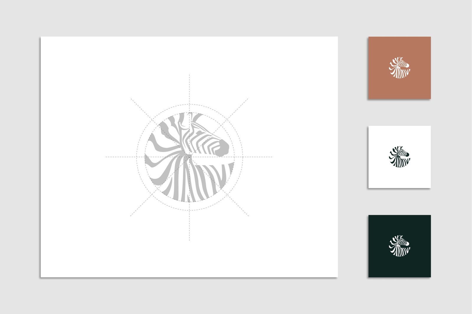
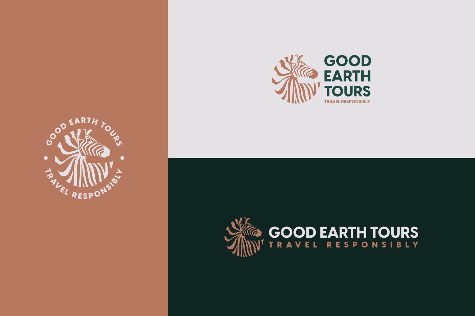
Identity change in full, from legacy mark to the new zebra-based system, with a clear logo suite that makes usage decisions easy to repeat.
Visuals: Old logo; new logo; construction grid; primary logo applications; secondary logo applications; circular version



Visuals II
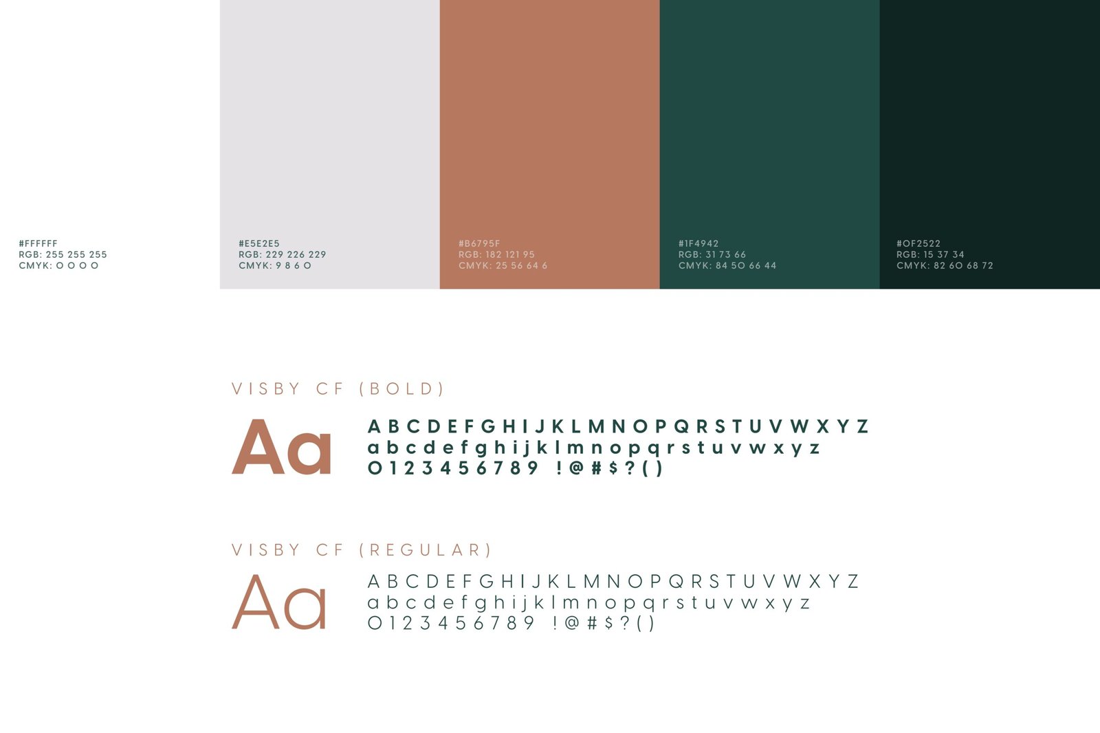
Colour, typography, and patterns locked, including Visby CF as the single brand font, so every new asset reads as one brand.
Visuals: Colour palette; font (Visby CF); brand patterns

Visuals III
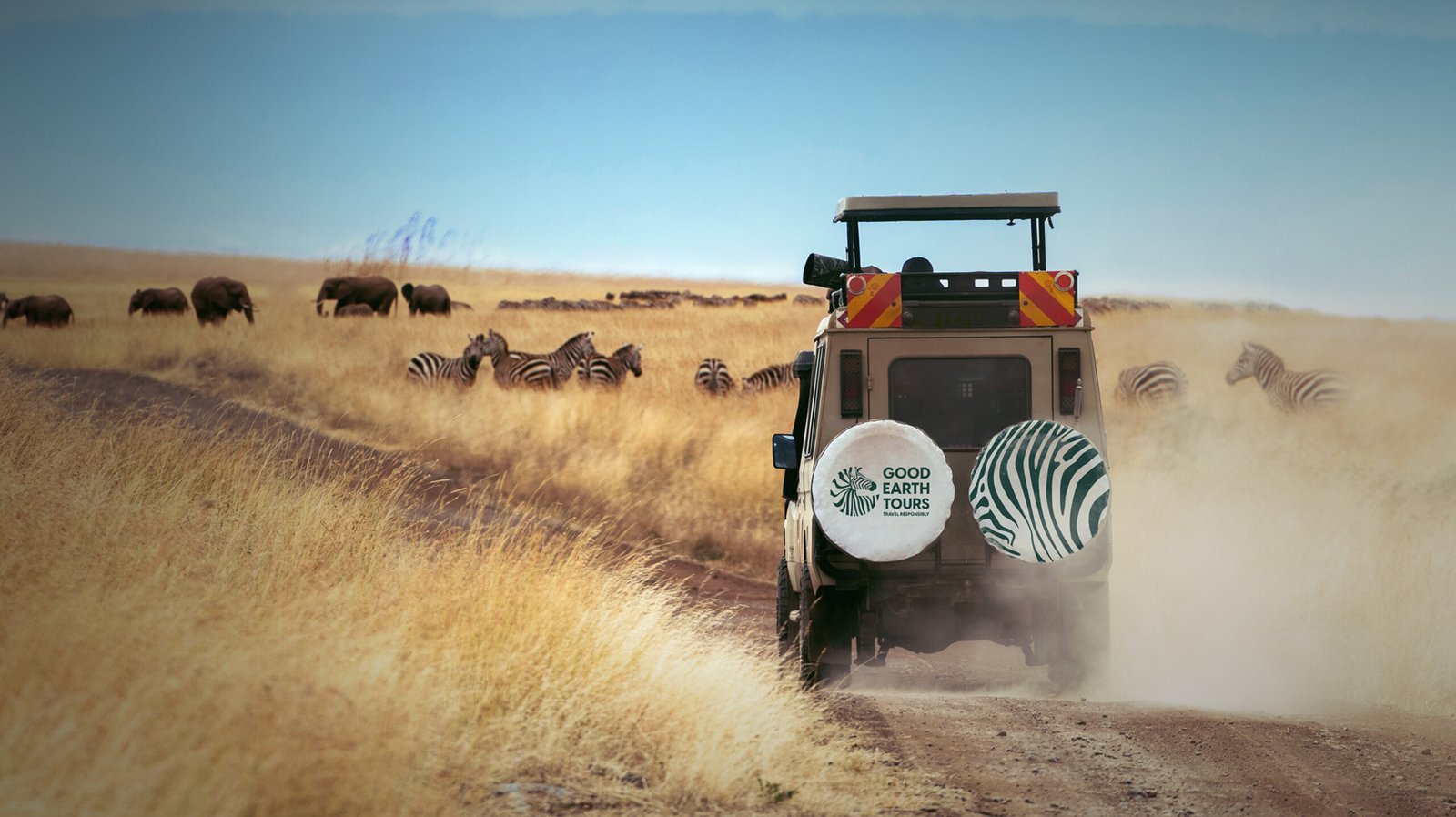
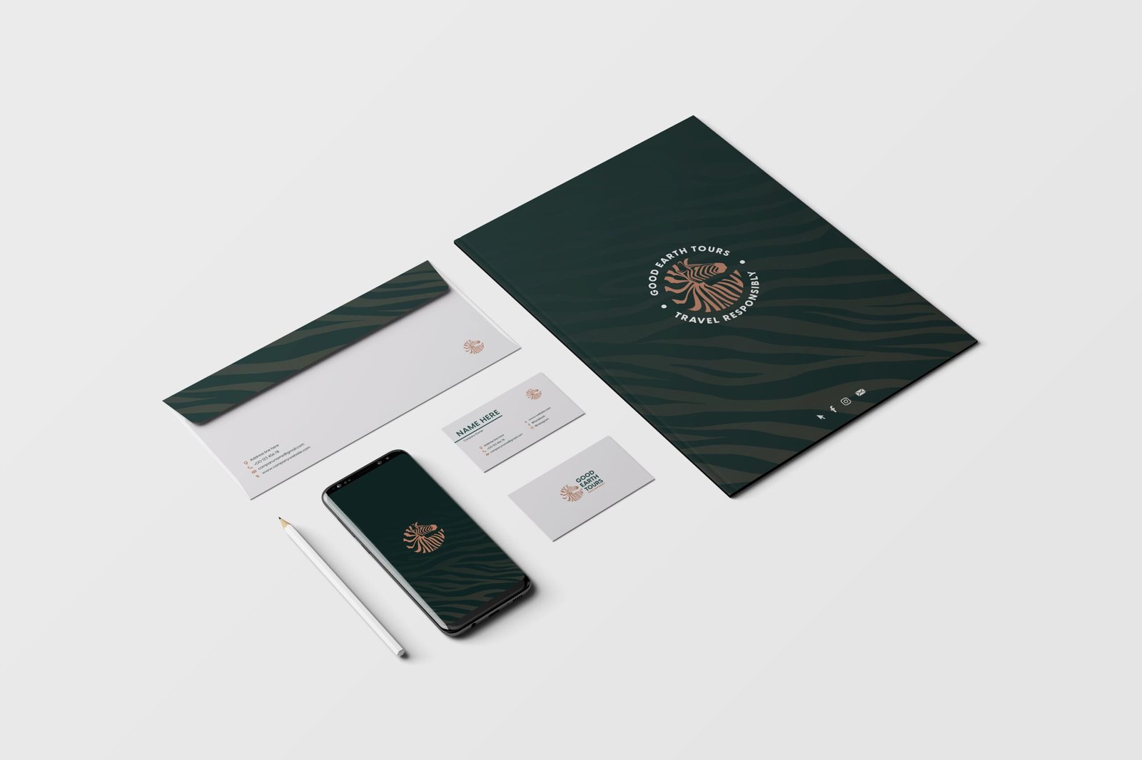
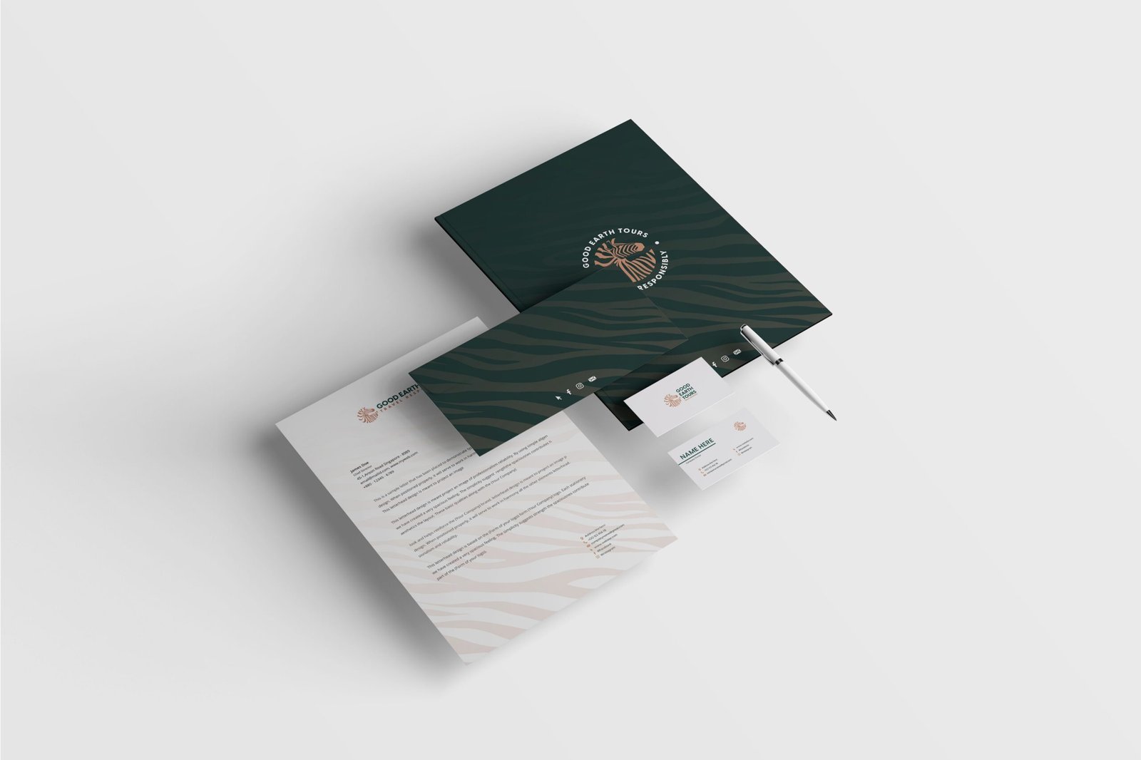
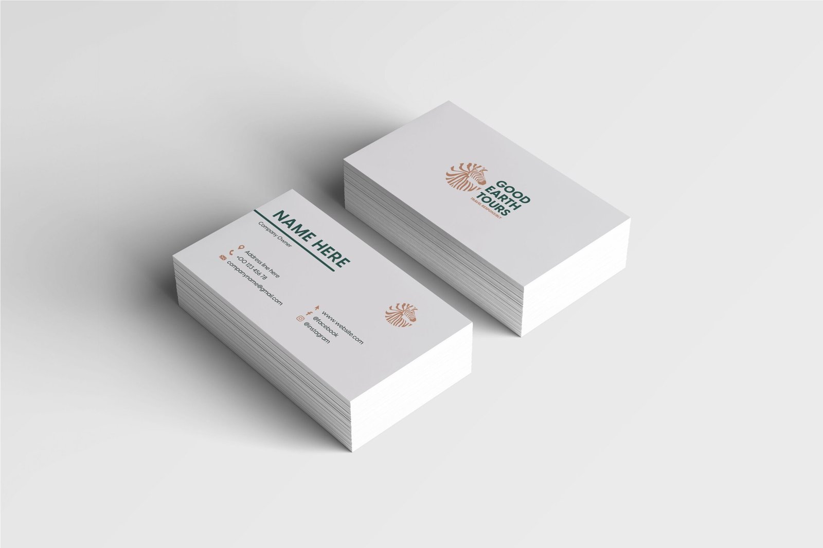
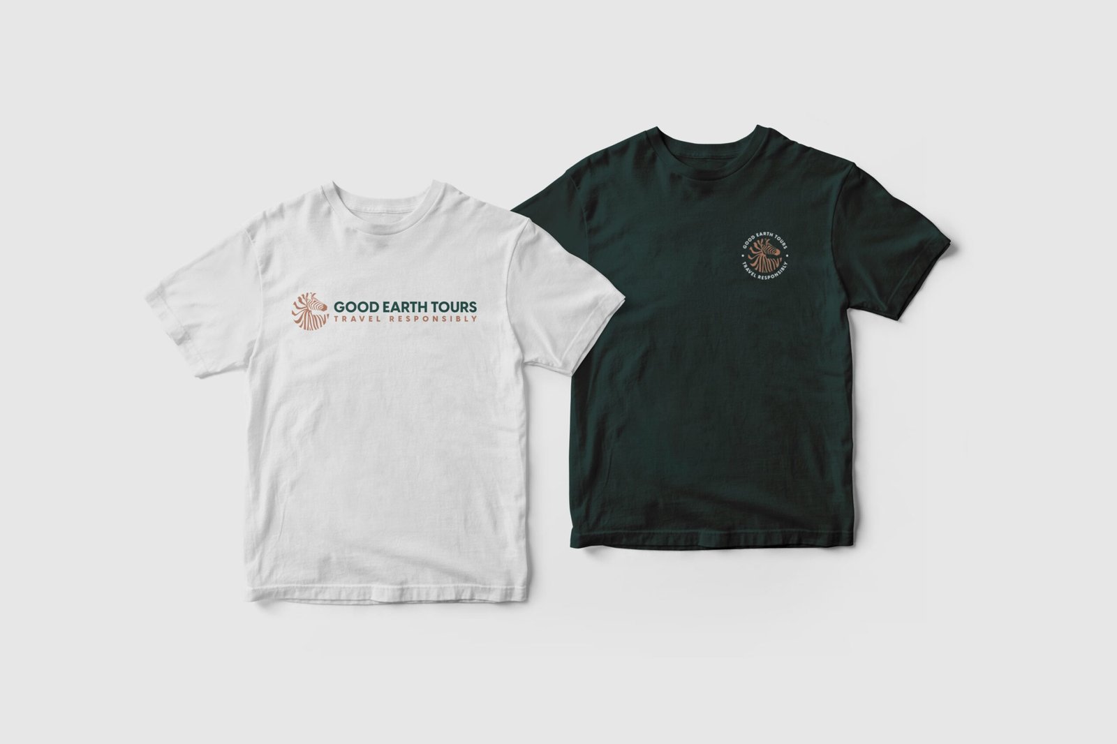
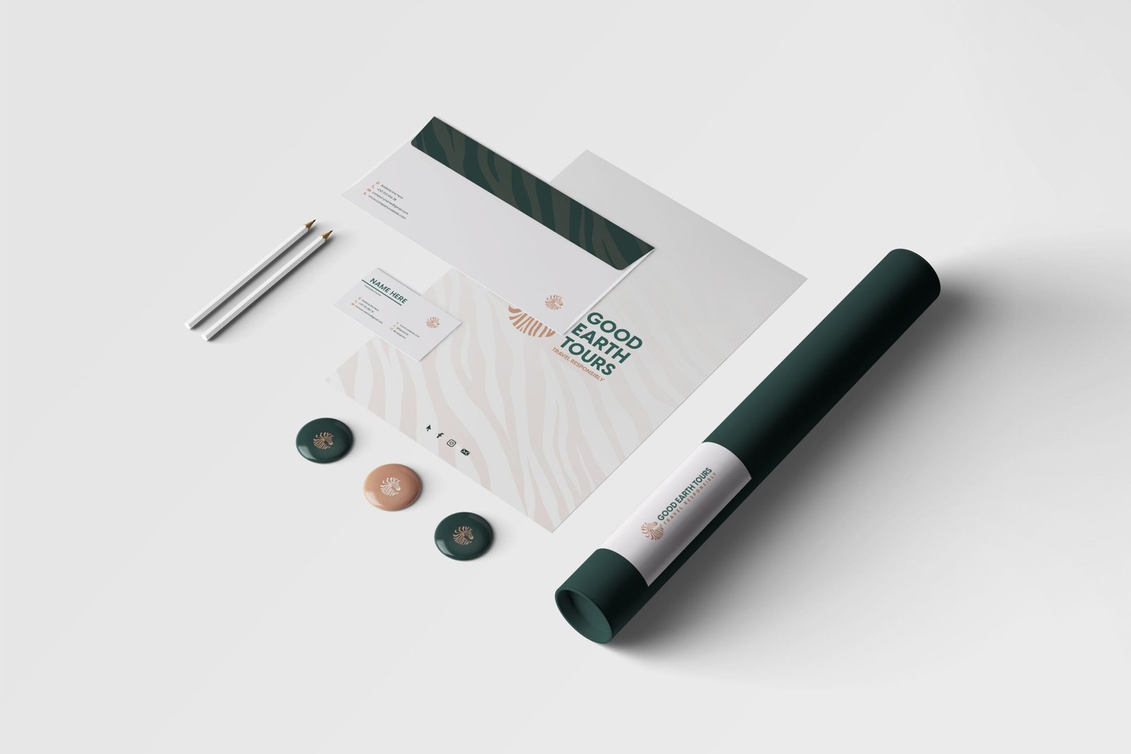
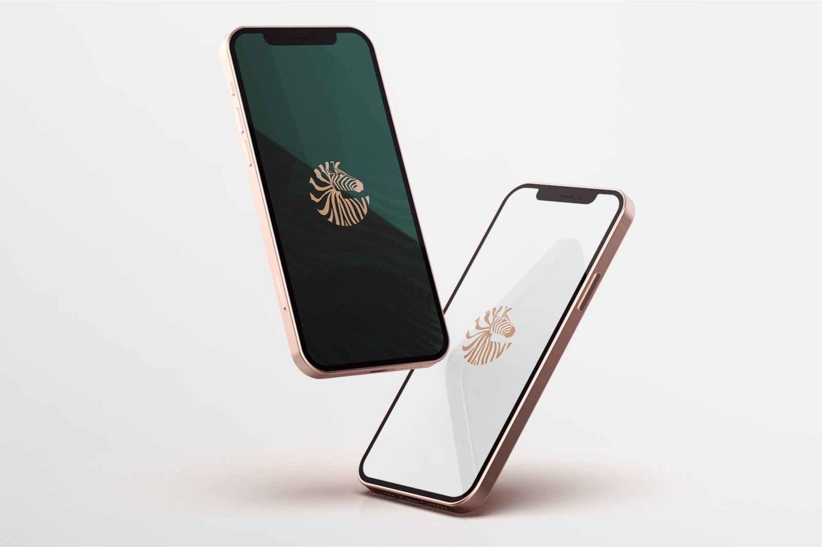
Real-world applications shown in context, proving the identity holds up before wider rollout work begins.
Visuals: Brand patterns; stationery mockups; apparel mockup; phone wallpaper mockup
Outcome
- A full rebrand delivered as a usable identity system with standards, files, and workflows.
- Legacy logo modernised into a clearer zebra-based system.
- Colour, typography, patterns, stationery, apparel, and digital mockups gave the team clearer usage direction.
- The approval path reduced subjective review and made the handover easier for future marketing.
Email me if your tourism or safari brand needs a rebrand direction review: st******@*******nd.net.