ADINA Lodges brand foundations
ADINA Lodges
External
Brand Foundations, Hospitality Identity
2022
Context
ADINA Lodges launched as a new luxury lodges brand and needed to feel established from the first release. Without existing assets or reference standards, the early identity decisions had to carry more weight. The work focused on logo use, type, colour, and first-use applications that could support wider rollout.
Scope: brand foundations; visual identity logic; typography direction; colour standards; application guidance.
Challenge
- Create a premium brand position without an existing asset base.
- Design a logo system that stayed recognisable across print, digital, and merchandise.
- Choose typography and colour that felt luxury-led without becoming decorative.
- Prepare early applications so the identity could move into real use with less guesswork.
Approach
- Defined the brand persona and narrative around refinement, restraint, and modern luxury cues.
- Built a logo suite with primary brandmark and supporting icon use for flexible application.
- Set typography standards to control hierarchy across future materials.
- Prepared colour and application guidance for repeatable print and digital use.
Visuals I
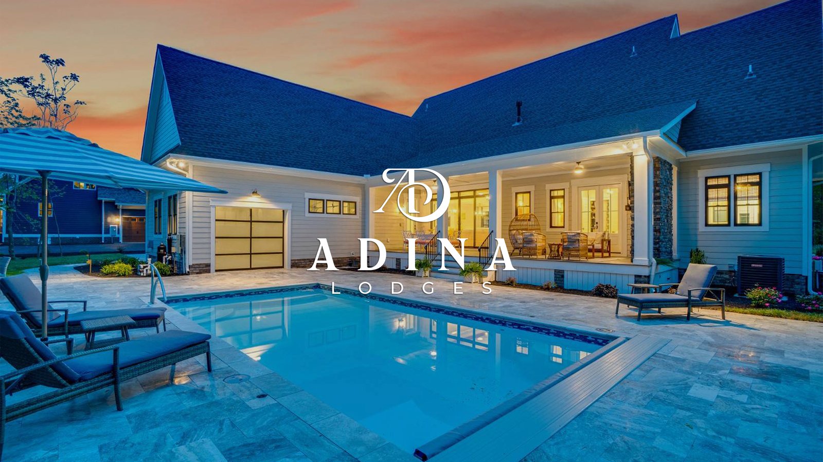
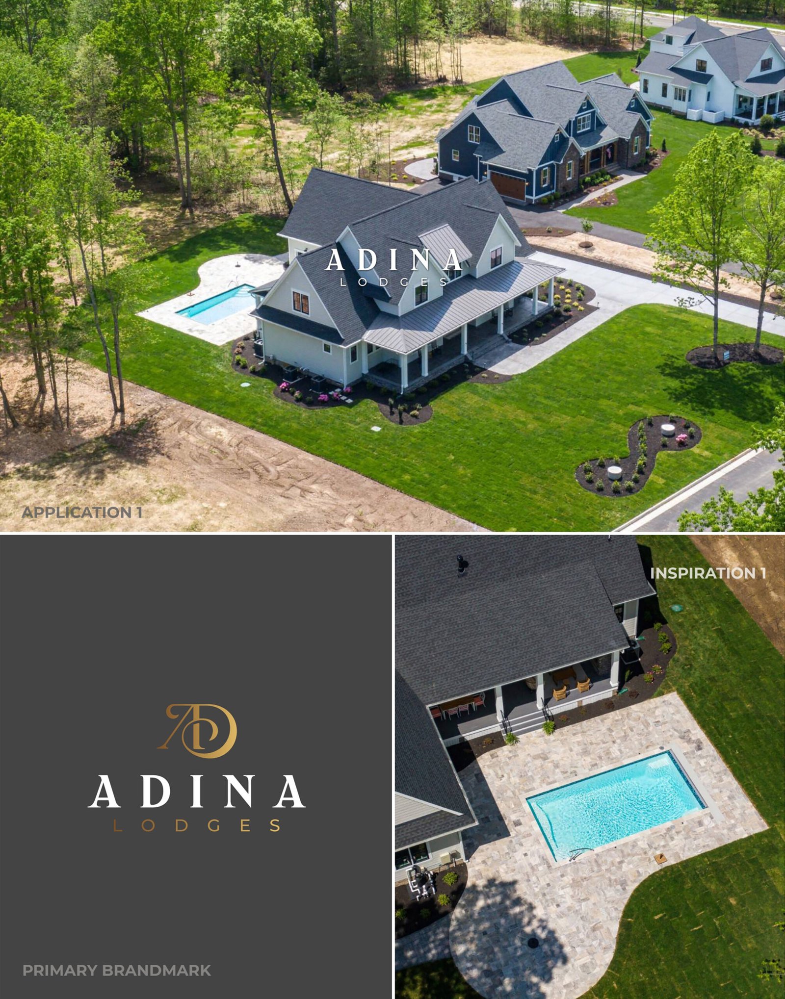
Real-world brand presence, showing the logo holding its character against premium hospitality imagery and dark backgrounds without losing legibility.
Visuals: Application 1 aerial placement; primary logo on dark background; inspiration reference image
Visuals II
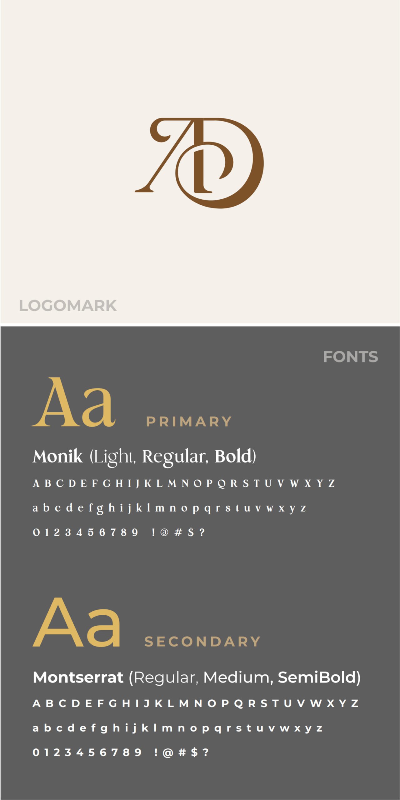
Core identity standards, showing the primary mark and the typography choices that control hierarchy and keep layouts consistent across materials.
Visuals: Logomark; typography system Monik (Light; Regular; Bold); typography system Montserrat (Regular; Medium; SemiBold)
Visuals III
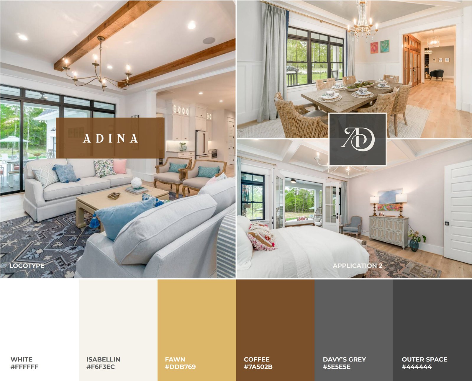
Roll-out readiness, showing consistent application in interiors alongside a defined luxury colour palette for repeatable use across print and digital.
Visuals: Application 2 interior placements; colour palette with codes
Outcome
- A complete brand identity system created from inception.
- Flexible logo suite prepared for print, digital, and merchandise use.
- Typography and colour standards defined for consistent hierarchy and tone.
- Early applications gave the brand a clearer base for future rollout.
Email me if your new hospitality brand needs clearer foundations before rollout: st******@*******nd.net.