

Love Boo needed a relaunch plan the team could run without lost files or unclear versions. The work reset the asset library, folder logic, naming rules and four-week campaign structure across social, email and web.
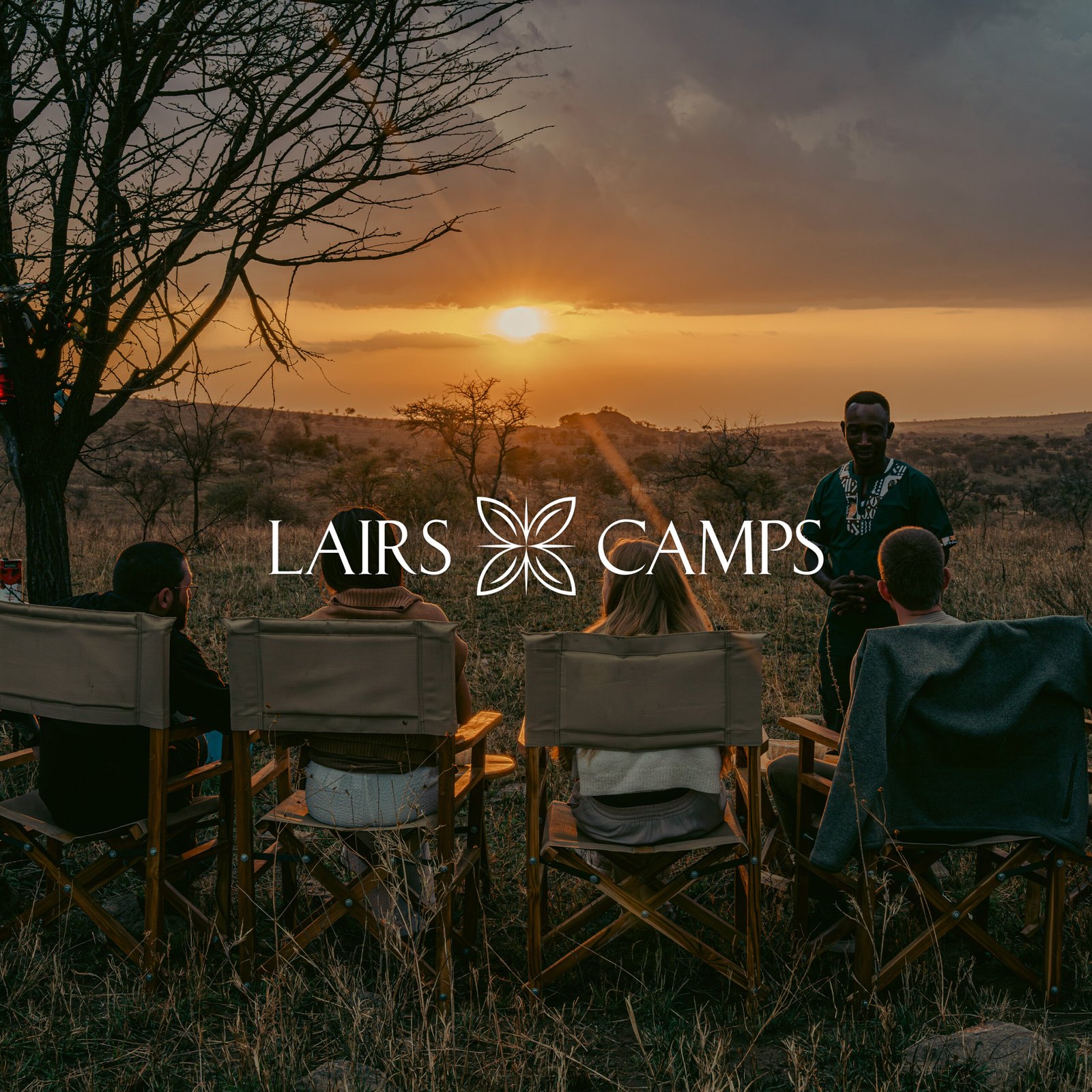
Lairs Camps needed clear foundations before rollout. Stakeholder input was shaped into one studio-ready brief, with review control, approval direction, organised files, usage rules and handover support.

Seissense needed clearer UGC direction across creators. A messy idea bank was rebuilt into a repeatable hook, visual direction and CTA format, with creator guidance that made briefs easier to use.
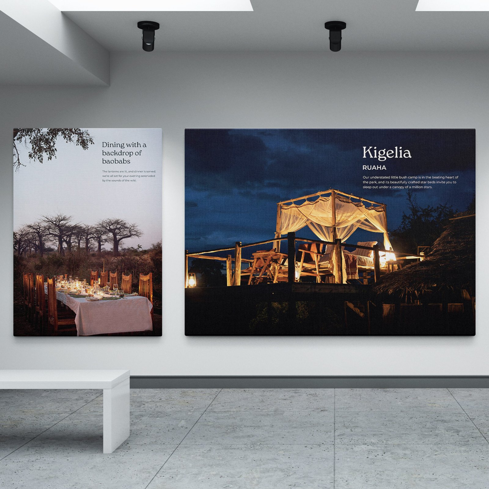
Nomad Tanzania needed its safari story translated into a physical office environment. The work directed 75+ canvases across 13 themed spaces, with production and installation control.
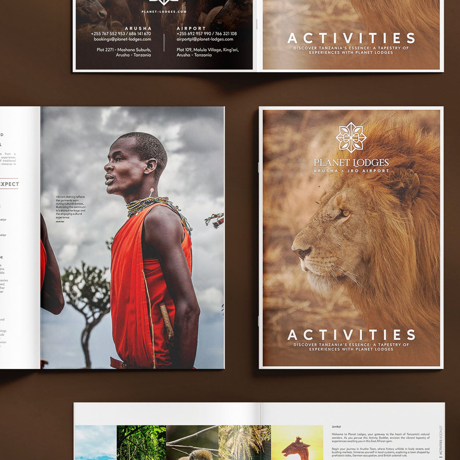
Planet Lodges needed the rebrand to show up properly in guest, trade and internal touchpoints. The rollout updated collateral, photography direction, signage, templates and social materials.
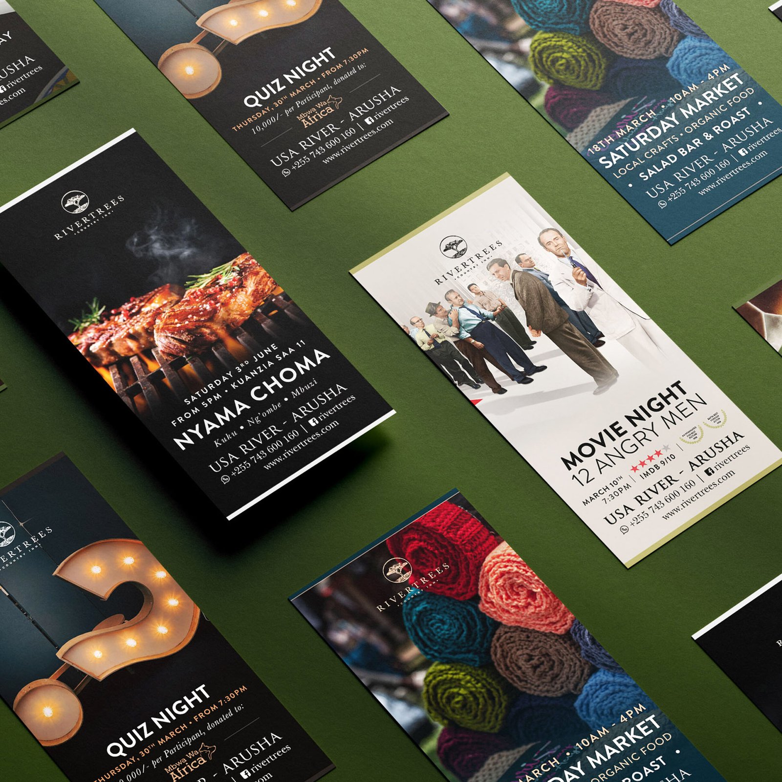
Rivertrees needed recurring events and seasonal promotions to feel more consistent. The work rebuilt event ads, seasonal offers and printed collateral into one clearer guest-facing standard.
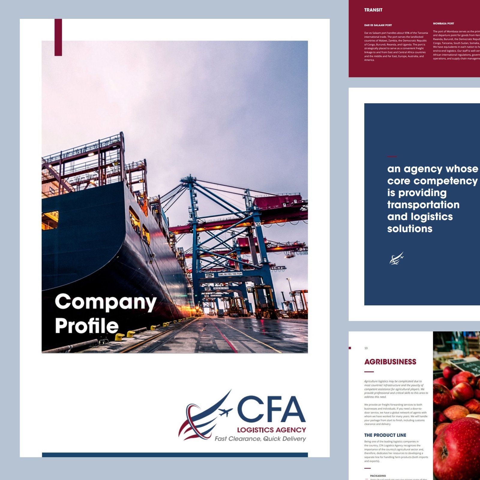
Editorial and publication work across tourism, hospitality, education and magazine publishing, shaping raw information into clearer brochures, reports, booklets and editorial assets.
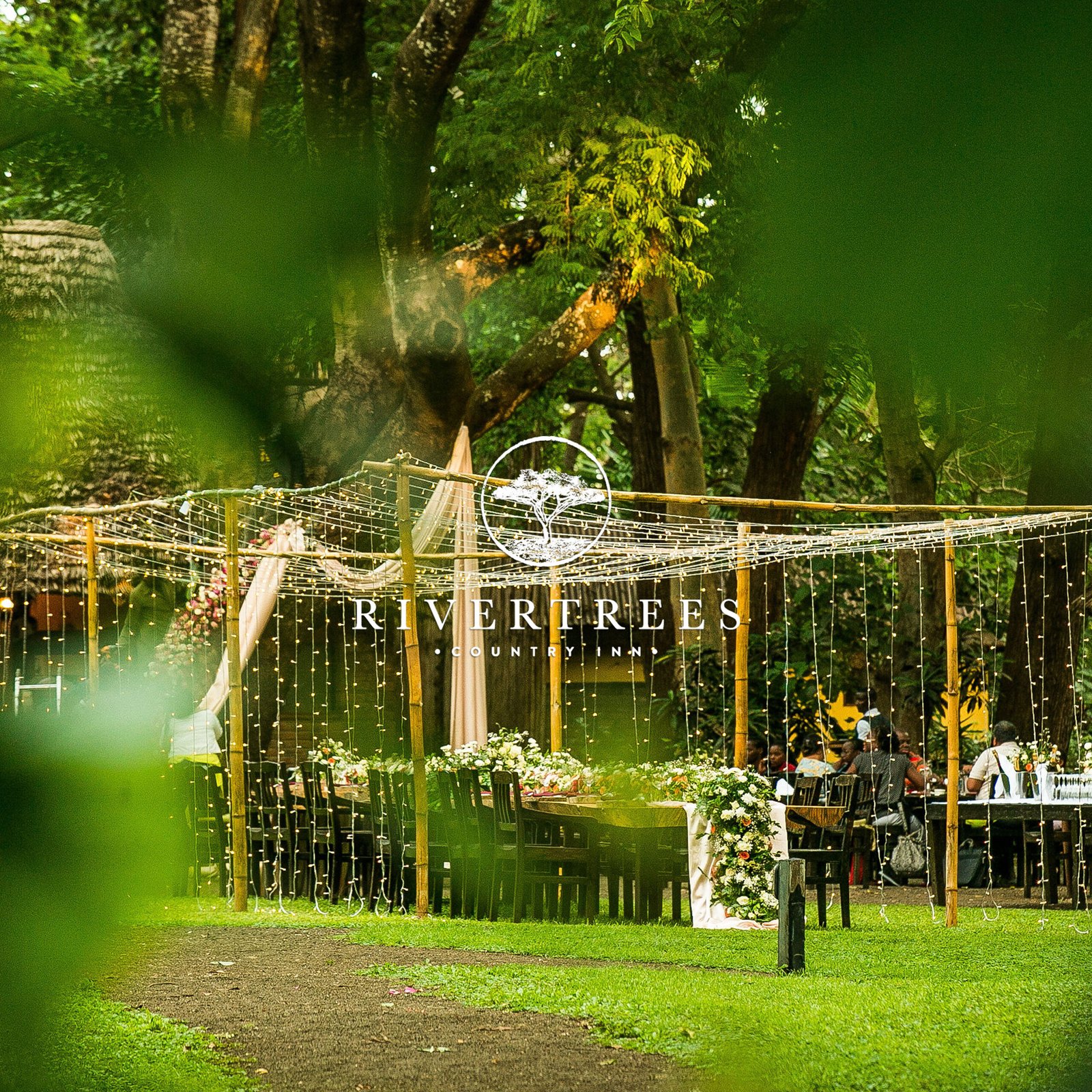
Rivertrees needed one joined-up festive season story. The Emerald Green theme carried through ads, menus, decor direction, print collateral and a directed photoshoot.

Planet Lodges needed a rebrand that worked in real use. The project set a clearer identity direction, controlled founder reviews and delivered organised brand files for future rollout.
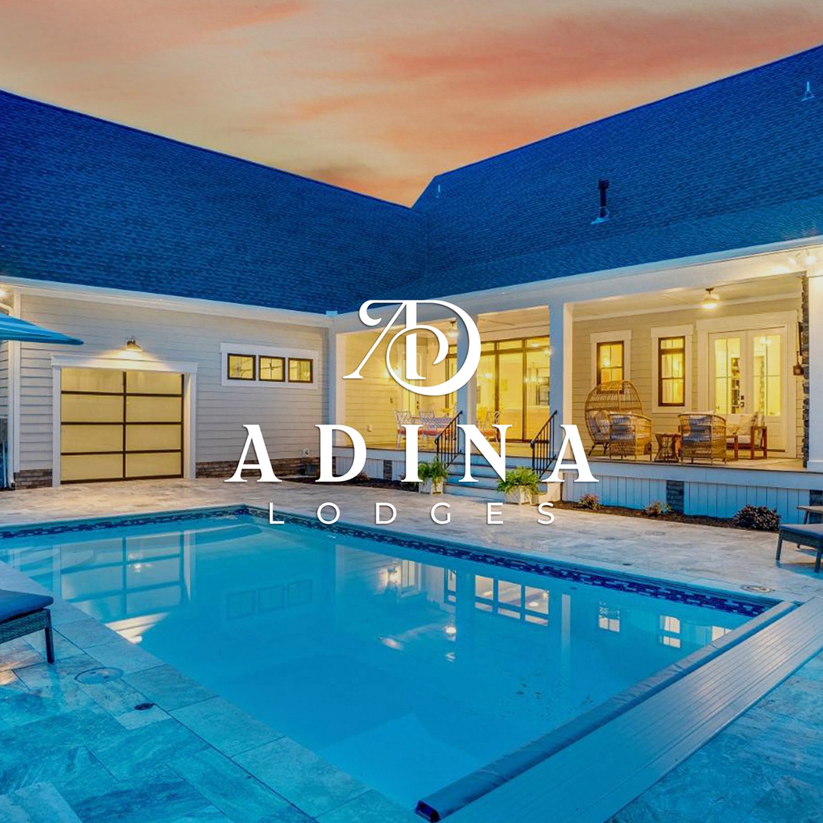
ADINA Lodges needed an early brand system before wider rollout. The work defined logo variations, typography, colour direction, first-use applications and organised files for consistent future use.

Good Earth Tours needed a more consistent and premium brand presentation. The rebrand refined the visual direction, controlled reviews and created a practical handover for future marketing.

British School of Zanzibar needed a clearer institutional identity. The work sourced external studio support, shaped leadership input into a brief and managed reviews through brand guide and template delivery.